Advanced Excel Dashboard Design for Business Intelligence course from Maven Analytics, where I sharpened my skills in building intuitive, high-impact dashboards using Excel.
This course went way beyond formulas—it was all about designing with purpose: telling a story, reducing noise, and delivering insights people can actually act on.
🎯 What I Took Away
Data Visualization Best Practices Learned how to choose the right chart, simplify visuals, and guide the viewer’s eye with clean design.
Dashboard Structure & User Experience Focused on layout, flow, and how to build dashboards that actually work for business users.
Real-World Scenarios Built four full dashboards across different industries, each with unique challenges and data goals.
📁 Dashboard Projects
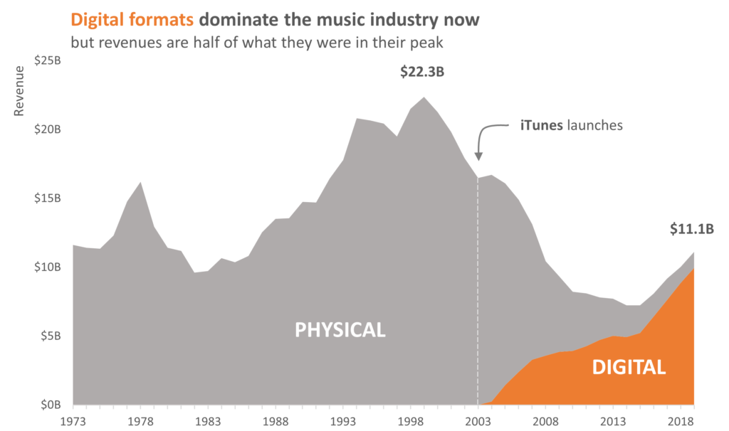
Maven Music Visualized 40+ years of music industry revenue to show the shift from physical to digital formats.
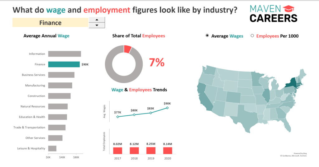
Maven Careers Explored U.S. labor stats with an interactive dashboard comparing wages and employment by industry.
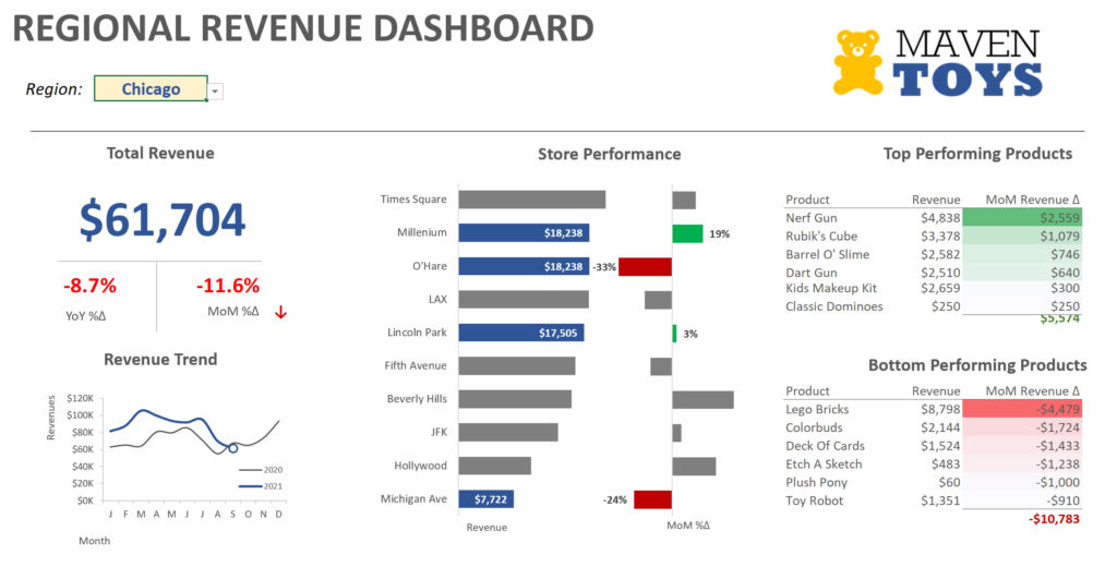
Maven Toys Created a KPI-driven dashboard for regional sales managers, with YOY tracking and slicer filters.
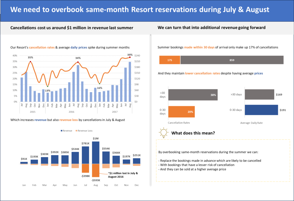
Maven Hotel Group Analyzed hotel bookings to uncover cancellation trends and key revenue drivers.
⚡ Why It Matters
This training didn’t just level up my Excel skills—it gave me a stronger foundation for building better dashboards across any BI platform, including Power BI and Tableau.
Even better? These design principles have already come in handy for some of the ad hoc Excel reports I’ve delivered during my sports career—helping teams make sense of complex data quickly and clearly.