Segmentation
Insights Dashboard
Who's filling the venue
and where are they?
Collegiate sports properties generate ticket sales from dramatically different buyer types — from devoted season-ticket loyalists to last-minute casual buyers. Without a way to distinguish between them, every marketing dollar gets distributed the same way to everyone.
The challenge wasn't just identifying segments — it was understanding their relative contribution to revenue versus tickets, their geographic concentration, and how those patterns varied market by market. A segment that over-indexes in one region might be nearly absent in another.
Most reporting answered “how many tickets did we sell?” This analysis was built to answer: who bought them, where did those people come from, and which segments are driving the most value per transaction?
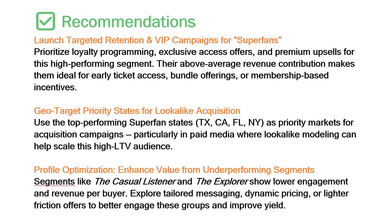
The output wasn't just a dashboard — it was the foundation for a targeted campaign that achieved a 5x return on ad spend by focusing creative and media on the highest-value segments in their highest-concentration markets.
From purchase data
to campaign strategy
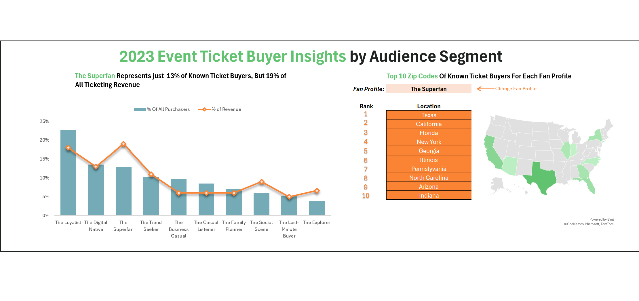
- Defined the 10-segment audience taxonomy — mapped behavioral and purchase patterns to named archetypes that were meaningful to both marketing and operations teams
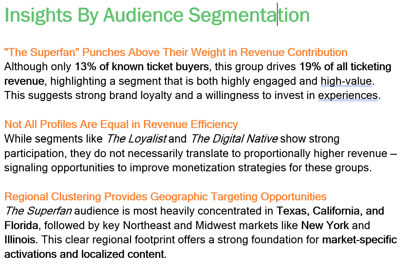
- Analyzed purchase data across segments — calculated ticket share and revenue share separately to surface the delta between volume buyers and value buyers
- Built geographic concentration analysis — identified top states per segment to enable precise regional media targeting
- Created segment mix by market view — surfaced over- and under-indexing segments across regions, giving properties actionable insight into where each audience type concentrates
- Built the Power BI dashboard — designed for marketing and strategy stakeholders, not data teams; optimized for fast interpretation and campaign decision support
- Professional project — this analysis was completed as part of my work in collegiate sports marketing at Learfield; this version uses anonymized dummy data to protect client and campaign details
- Directly actionable — the output wasn't a research artifact; it was immediately handed to campaign managers as the targeting brief for creative and media deployment
- Built for non-technical stakeholders — every view in the dashboard was designed so a marketing director could make a decision in under 60 seconds without SQL access
- Geography was the unlock — the segment taxonomy alone was useful; knowing that The Loyalist concentrates in specific states and The Digital Native in others was what turned insight into action
- 5x ROAS outcome — the campaign informed by this analysis delivered a 5x return on ad spend by focusing on the highest-value segments in their highest-density markets
From purchase data
to targeting brief
Five stages — from raw transactional data to a campaign-ready audience map.
Ten archetypes.
One complete picture.
Each segment was defined around a distinct behavioral profile — how they buy, when they buy, how much they spend, and what motivates them to show up. Naming the segments made them real to stakeholders in a way that raw cohort IDs never could.
Revenue vs. tickets.
Where the delta lives.
A Power BI dashboard built for marketing decision-makers — each view answers one specific question a campaign manager actually asks before allocating budget.

The stat sheet
Key decisions & tradeoffs
The choices that shaped the analysis — especially the ones where the “richer” option was deliberately not the right one.
| Decision | Rationale | Tradeoff |
|---|---|---|
| Named segments over cohort IDs | Labeling segments with human names (The Loyalist, The Digital Native) rather than numeric cohorts made the taxonomy immediately usable by marketing teams who had no analytical background. Stakeholders could talk about segments in creative briefs and media plans without needing to reference a data dictionary. | Less technically precise — named archetypes carry implicit assumptions that raw cohort IDs don't. The tradeoff was deliberate: a segment that drives action is worth more than one that's methodologically pristine but unused. |
| Ticket share vs. revenue share separated | Keeping ticket volume and revenue contribution as distinct metrics was the analytical unlock. Many segments had inverted profiles — high ticket share but low revenue share (The Casual Listener) or low ticket share but high revenue share (The Business Casual). Blending them into a single metric would have obscured the delta entirely. | Cleaner campaign logic — separating the two allowed media budgets to target value segments rather than just volume segments, which directly contributed to the 5x ROAS outcome. |
| Geography as the primary action lever | The segment taxonomy alone told you who to target. The geographic concentration view told you where. Combining them was what turned the analysis from interesting to actionable — a media buyer could translate it directly into a regional paid social or programmatic strategy. | Immediately deployable — no additional data transformation required between dashboard and media plan. The geographic output was the targeting brief. |
| Designed for decision speed, not exploration | The dashboard was built for a marketing director making a budget call, not an analyst doing exploratory research. Every view answers one specific question and surfaces the answer in the top half of the screen. Filtering and drill-down were secondary to immediate readability. | Limited self-serve depth — the dashboard doesn't support ad hoc slicing by an analyst user. A deeper exploration layer was deliberately scoped out in favor of decision-speed for the primary audience. |