IceBase
Data Engineering · ML · BI
🏗 Architect + Builder
Independent Project
⚠ Simulated Data
IceBase —
Hockey Analytics
Platform
A full-stack data engineering, machine learning, and business intelligence platform built on Databricks for the Idaho Mashers — a mock professional hockey franchise. From raw seed data through a Lakeflow declarative pipeline, Unity Catalog medallion architecture, K-Means fan segmentation, XGBoost churn prediction with MLflow tracking, and three branded AI/BI dashboards.
Databricks
Delta Lake
Unity Catalog
Lakeflow Pipelines
K-Means Clustering
XGBoost
MLflow
AI/BI Dashboards
Medallion Architecture
Auto Loader
PySpark · SQL · Python

Idaho Mashers
View on GitHub →
Project Phases
Six phases.
Five delivered.
1
Foundation
Seed data generator · 5k fans · 82 games · Narrative encoding
2
Pipeline
Lakeflow declarative · Bronze→Silver · Auto Loader · DQ Expectations
3
Gold Layer
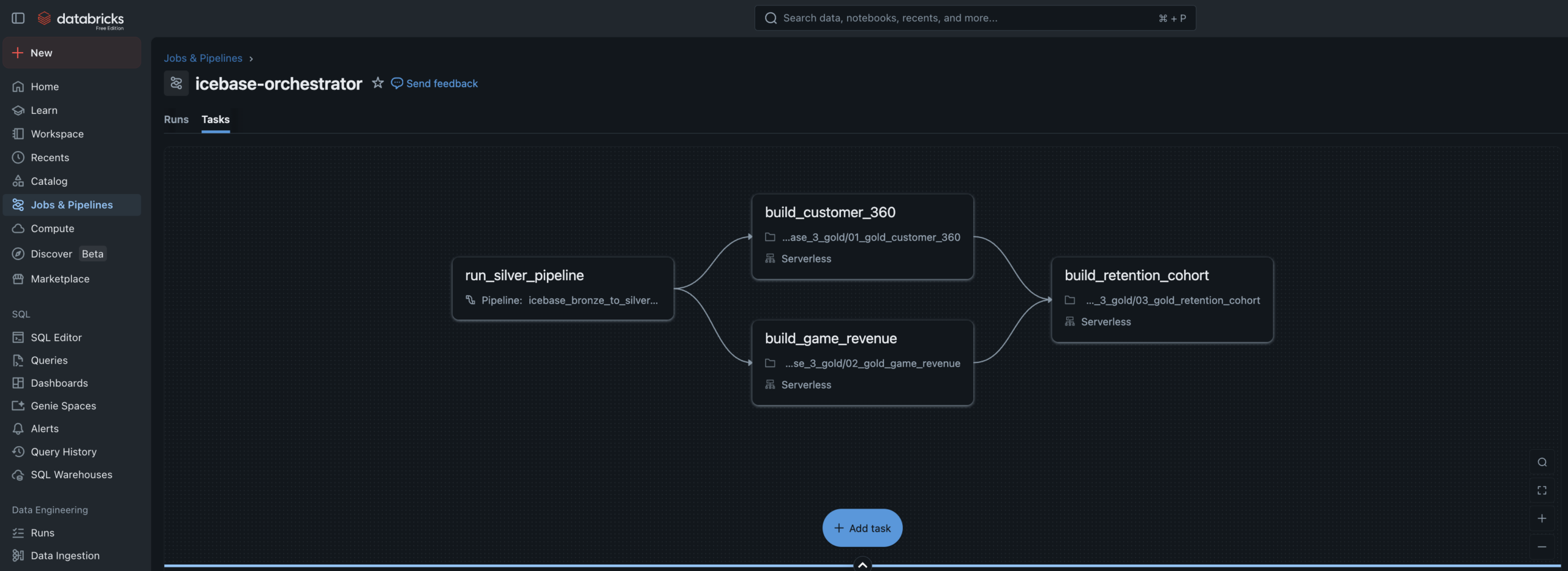
customer_360 · game_revenue · retention_cohort · Job DAG
4
ML Models
K-Means segments · XGBoost churn · MLflow · UC Registry
5
Dashboards
3 AI/BI dashboards · Fan Health · Revenue Ops · Segments
6
Alerts
SQL Alerts · Monitoring capstone To-Do
The Design Philosophy
The data existed.
The story didn’t.
Most data engineering portfolio projects generate random data, build a pipeline on top of it, and stop there. The output is technically correct but tells no story a business person would recognize.
IceBase was designed differently. Every number in this platform was deliberately authored to reflect real business situations that sports organizations actually face — a hot start, a midseason slump where marketing over-relied on discounts, a late-season comeback, and a jersey retirement ceremony that became the single biggest fan acquisition event of the year.
The goal was to build a platform where every spike and drop in the data has a cause you can explain to a CMO, a VP of Revenue, or a retention manager. The pipeline, the ML models, and the dashboards were all built to surface both the good stories and the bad ones.
The season arc — hot start, midseason slump, late push, Jersey Night — is encoded as a Python configuration object in the seed generator. Every downstream table, model, and dashboard inherits this narrative. That’s what makes it a business intelligence project, not just a data engineering exercise.
Design Principle 01 · Authored NarrativePhase weights control fill rate, price multiplier, promo rate, and fan acquisition volume for each game range. The data isn’t random — it’s intentional.
Design Principle 02 · Good & Bad StoriesFour good stories and four bad stories baked into the seed data. Promo over-reliance, walk-up acquisition quality, Jersey Night reactivation — all visible in the dashboards.
Design Principle 03 · Business PersonasEvery dashboard answers exactly one executive’s questions — CMO, VP Revenue, Marketing Strategy. Data engineering is only valuable when it drives decisions.
Design Principle 04 · Production PatternsQuarantine routing, MLflow lineage tracking, champion model aliases, Lakeflow declarative pipelines — not tutorial patterns. Production patterns.
✓ Good Stories in the Data
- Season Core fans showed near-zero churn through the slump — proving loyalty program ROI
- Jersey Night reactivated 94 deeply lapsed fans and drove a 31% 30-day return rate
- XGBoost model flagged 600+ at-risk fans before full churn — with a real intervention window
- 412 net-new fans acquired on Jersey Night — highest single-event acquisition of the season
↯ Bad Stories in the Data
- Promo over-reliance during the slump grew the Promo Hunter segment from 8% to 22% of the fan base
- 67% of walk-up buyers from the hot start never attended another game — vanity acquisition metrics
- Marketing had no follow-up playbook for the 412 Jersey Night new acquisitions — 61% received zero outreach
- Data leakage caught in XGBoost training — AUC of 1.0 diagnosed and fixed to a real 0.94
Architecture
Medallion architecture
end to end.
Unity Catalog governs every layer. Lakeflow handles Bronze→Silver declaratively. Gold is orchestrated by a multi-task Job DAG. ML models live in the Unity Catalog Model Registry with full feature lineage.
IceBase Pipeline ArchitectureDatabricks Free Edition · Unity Catalog · Lakeflow · MLflow · AI/BI Dashboards
icebase.(bronze|silver|gold)
Simulation
Python Faker
Seed Generator
Pipeline Kickoff
Simulator
Volume
Landing Zone
→
Bronze
raw_tickets
_stream
raw_customers
_stream
raw_events
raw_promotions
→
Silver
dim_customer
fact_tickets
dim_game
bridge_promo
quarantine
_tickets
→
Gold
customer_360
fan_features
game_revenue
retention_cohort
ml_fan_segments
ml_churn_scores
→
ML Layer
K-Means
Segmentation
XGBoost
Churn Model
MLflow
UC Registry
→
Serving
Fan Health
Dashboard
Revenue Ops
Dashboard
Segment
Explorer
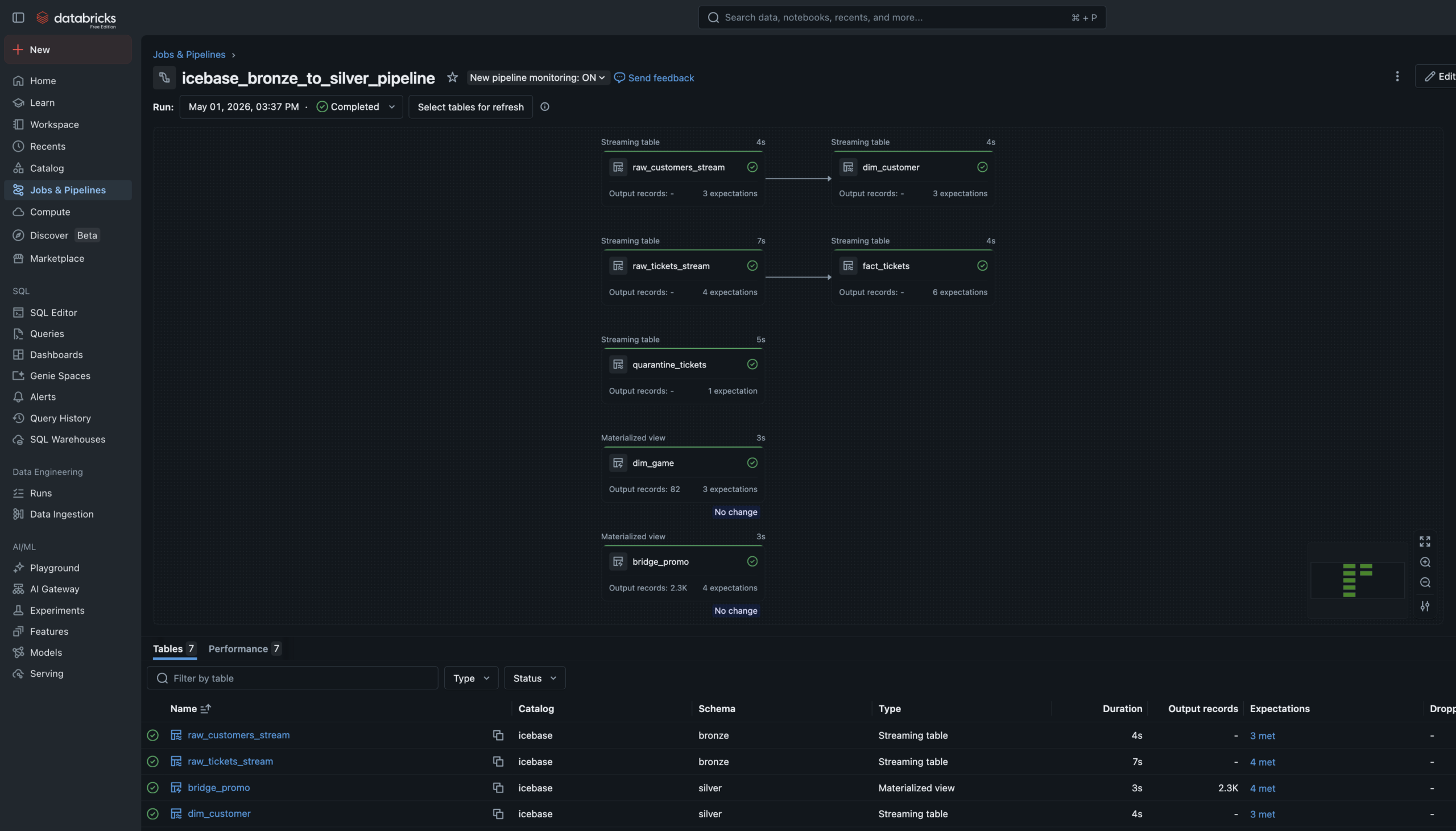
Phase 2 — Lakeflow Pipeline
Declarative Bronze
to Silver.
The Bronze→Silver pipeline is a Lakeflow Spark Declarative Pipeline — six notebooks registered as pipeline source files. The language split is intentional: SQL for single-source streaming tables and materialized views, Python for tables that need to union two independent readStreams.
Auto Loader watches the Unity Catalog Volume landing zones and ingests new JSON files incrementally — only processing files not yet seen. Schema evolution is handled automatically. Checkpoint management is owned by the pipeline runtime.
Data Quality Expectations are enforced at Silver. Null IDs and invalid prices are hard-dropped via expect_or_drop. Bad records don’t disappear silently — they route to a quarantine_tickets table for investigation.
6 Pipeline Notebooks4 SQL + 2 Python. SQL for streaming tables and materialized views. Python where two independent readStreams need to be unioned — which SQL can’t express cleanly.
Streaming Tables + Materialized ViewsStreaming Tables for append-only sources (Auto Loader ingest, Silver cleaning). Materialized Views for static/batch sources like the game schedule and promo history.
Quarantine RoutingMost pipelines silently drop bad records. This one routes them to a named quarantine table — preserved for investigation. A production pattern, not a tutorial shortcut.
Phase 3 — Gold Layer
Three Gold tables.
One automated Job.
c360
customer_360
One row per fan. Total spend, promo sensitivity score, churn flag, revenue net, Jersey Night attendee flag. The CMO’s fan dossier.
rev
game_revenue
One row per game. Gross vs net revenue, fill rate, 3-game rolling average, revenue index vs season average. 82 rows exactly.
ret
retention_cohort
30-day and 60-day return windows, churn flag, Jersey Night cohort flag. The ML training ground for Phase 4.
dag
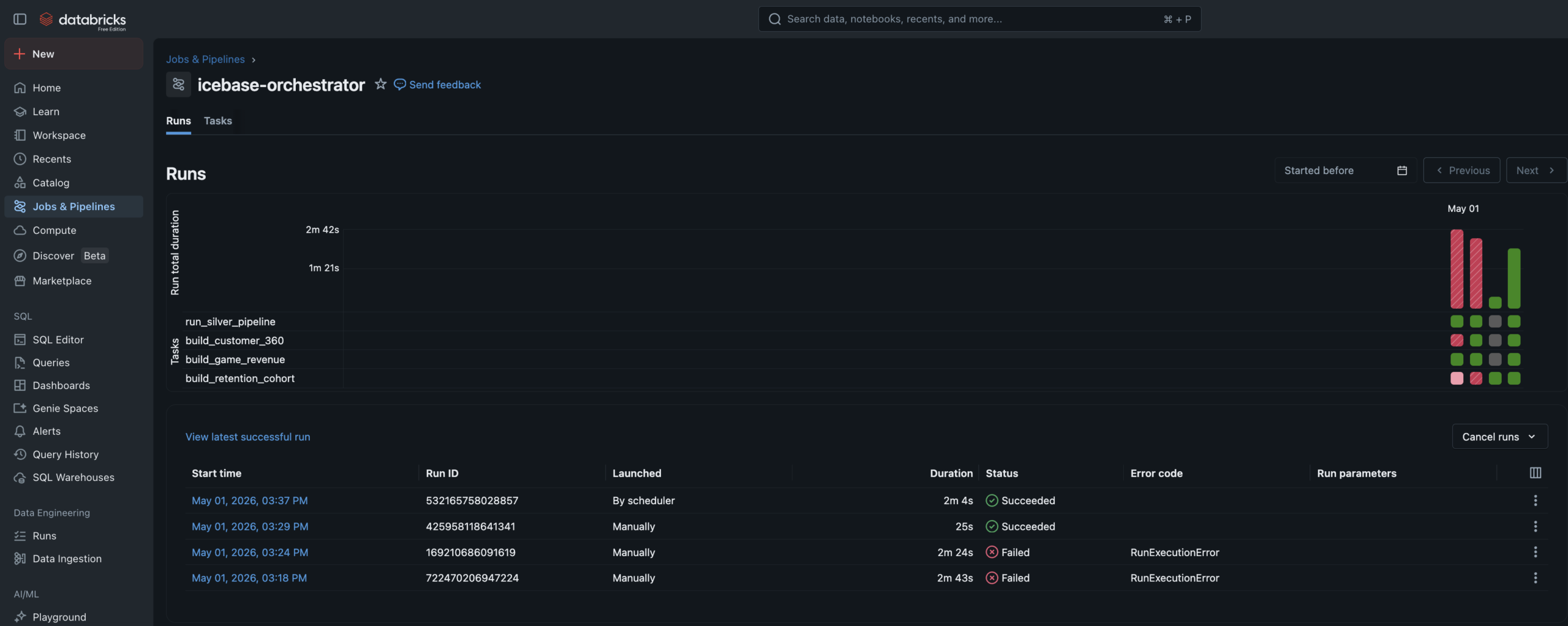
Job DAG
4-task Lakeflow Job. Silver pipeline → customer_360 + game_revenue in parallel → retention_cohort. Runs every 30 minutes.
sim
Simulator
Kickoff notebook drops new ticket and customer JSON files to Volumes, triggering the full automated pipeline end to end.
Phase 4 — Machine Learning
Two models.
Full lineage.
Both models read from a Unity Catalog Feature Table, tracked in MLflow with full experiment logging, and registered in the Unity Catalog Model Registry. Predictions write back to Gold as enrichment tables.
Fan Segmentation
Unsupervised
5Clusters
K-MeansAlgorithm
- Features: RFM metrics, promo sensitivity, seat tier rank, tenure, purchase timing
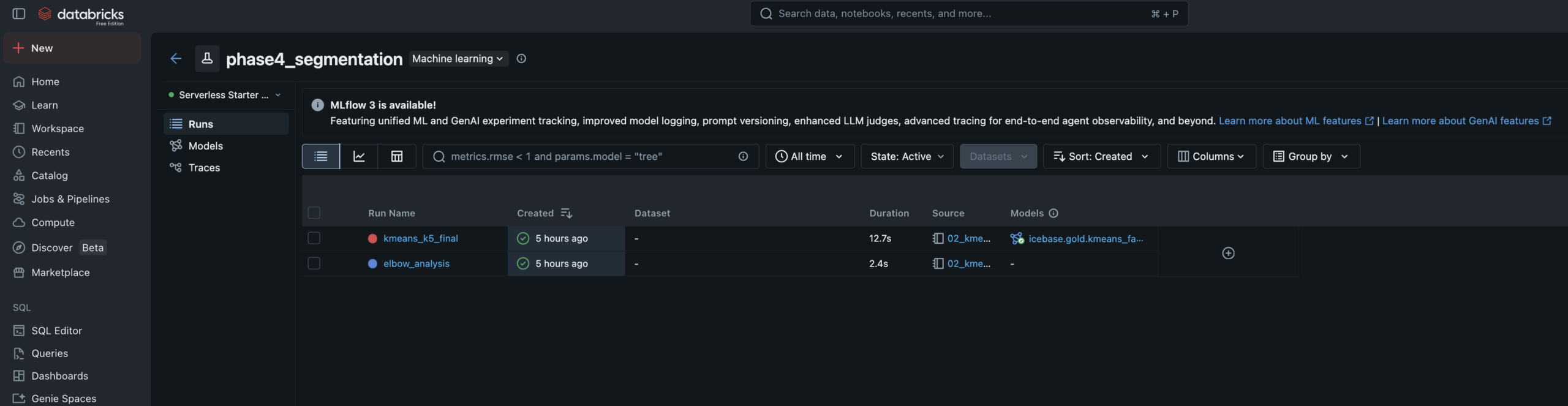
- Elbow analysis run for k=2–8, logged to MLflow — k=5 selected at inflection point
- Cluster labels assigned manually by reading centroid profiles — practitioner judgment step
- Segments: Season Core · Casual Fan · Promo Hunter · Lapsed · Deeply Lapsed
- Writes
icebase.gold.ml_fan_segmentsback to Unity Catalog
Churn Prediction
Supervised
0.94AUC
0.85Accuracy
- Algorithm: XGBoost binary classifier — churn defined as no purchase in 45+ days
- Training data: Built via FeatureEngineeringClient for full feature lineage tracking
- Data leakage caught and fixed — AUC of 1.0 diagnosed (recency_days leakage), resolved to 0.94
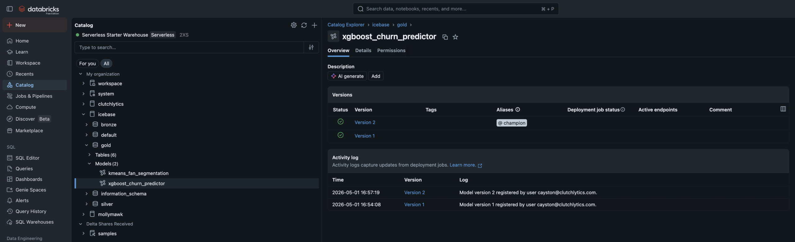
- Champion alias set in UC Model Registry — promoting new versions requires no code changes
- Writes
ml_churn_scoreswith High/Medium/Low risk tiers
⚡ The Leakage Story — Worth Calling Out
During initial training, the XGBoost model produced an AUC of 1.0 — a near-perfect score that is almost always a red flag, not a success. The cause: recency_days and churn_flag were mathematically derived from the same underlying value — days since last purchase. The model wasn’t learning fan behavior, it was learning a tautology. Removing recency_days brought the model to a realistic 0.94 AUC. Catching this and knowing why it happened is the difference between someone who ran a tutorial and someone who understands the craft.
Phase 5 — AI/BI Dashboards
Three dashboards.
One team, one brand.
Three AI/BI dashboards built on Databricks SQL — each one answering a specific executive’s questions. Branded with the Idaho Mashers identity. All powered live from Gold and ML output tables.
Fan Health Dashboard
Audience: CMO · Retention Manager
PHASE 5
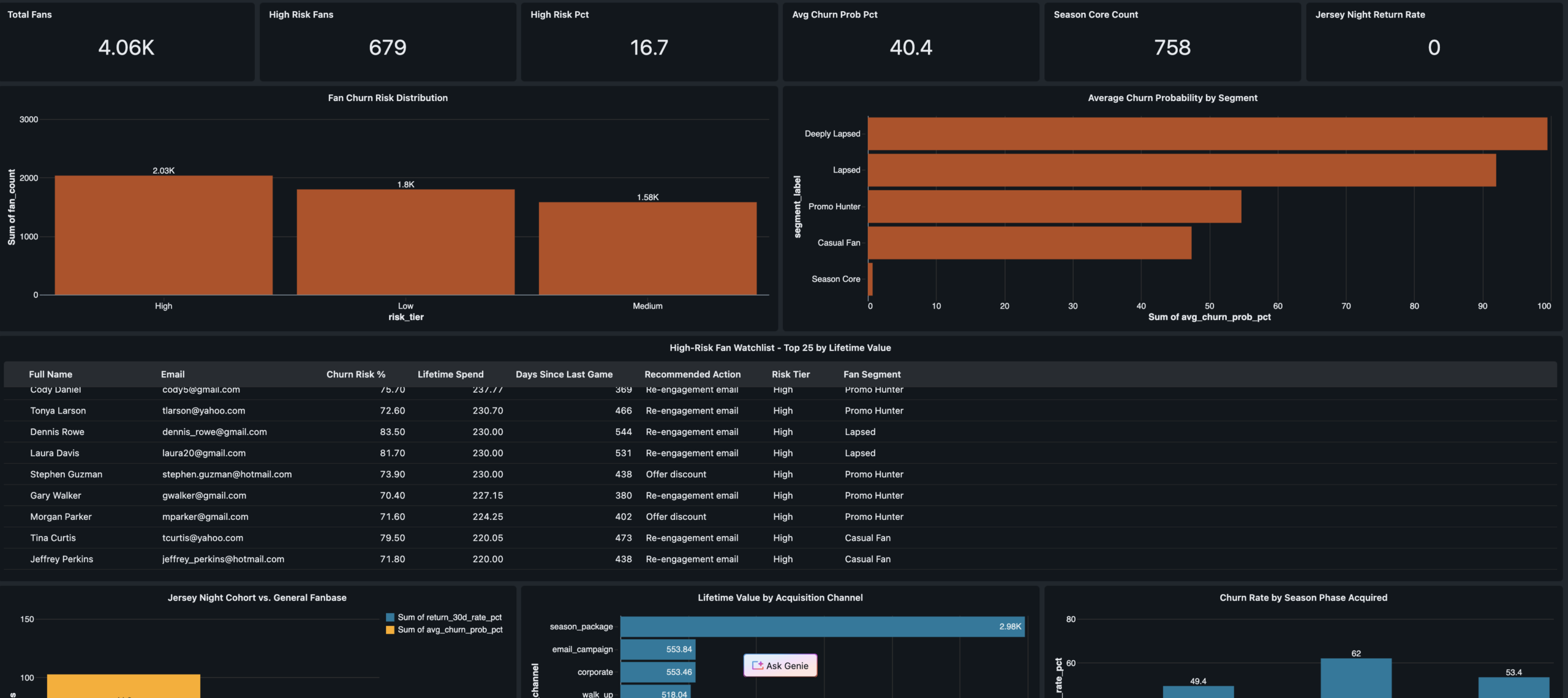
KPI scorecard · Churn risk distribution · High-risk fan watchlist with recommended actions · Jersey Night cohort 30-day return comparison · Acquisition channel quality analysis
Revenue Operations
VP Revenue · Finance
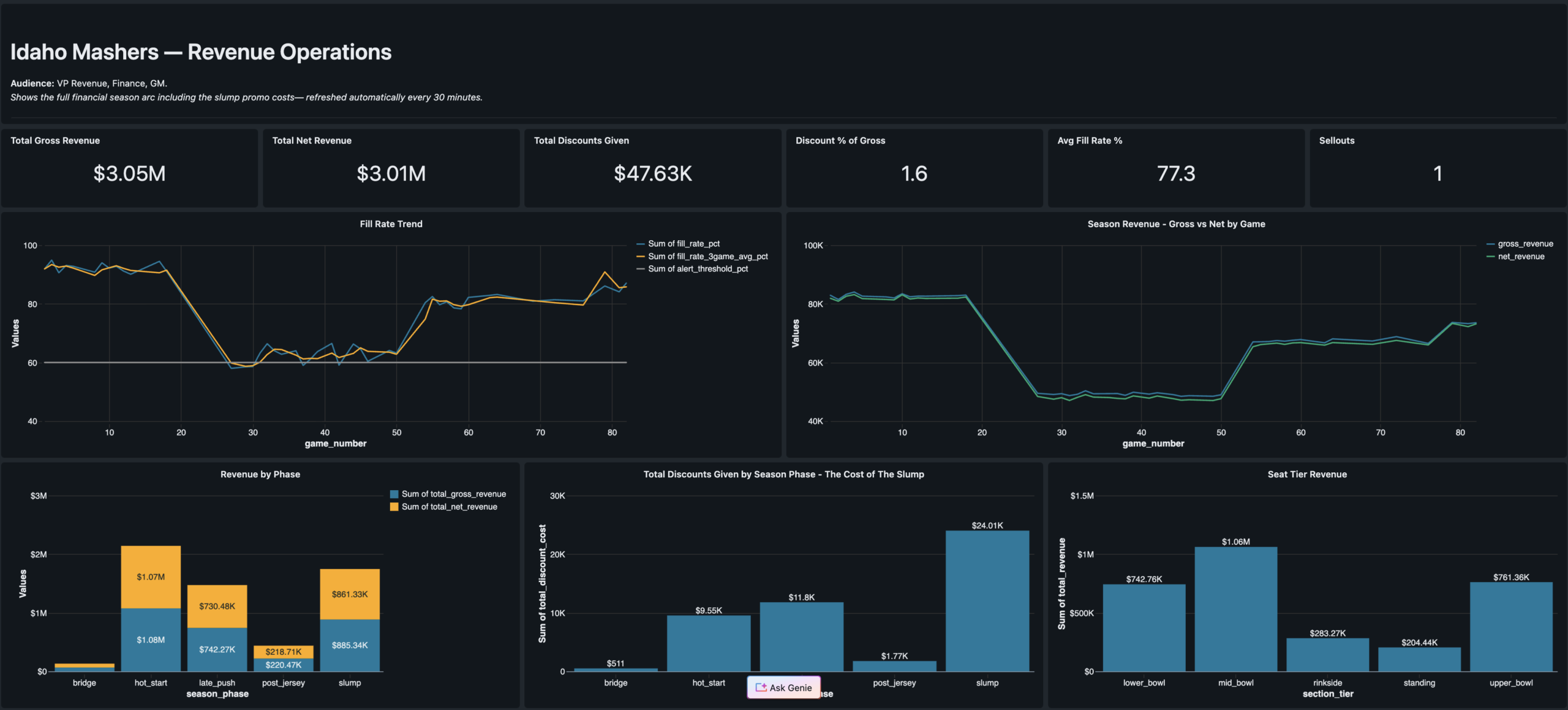
Season revenue arc · Jersey Night spike · Promo cost by phase · Fill rate trend
Segment Explorer
Marketing Strategy · Campaign Managers
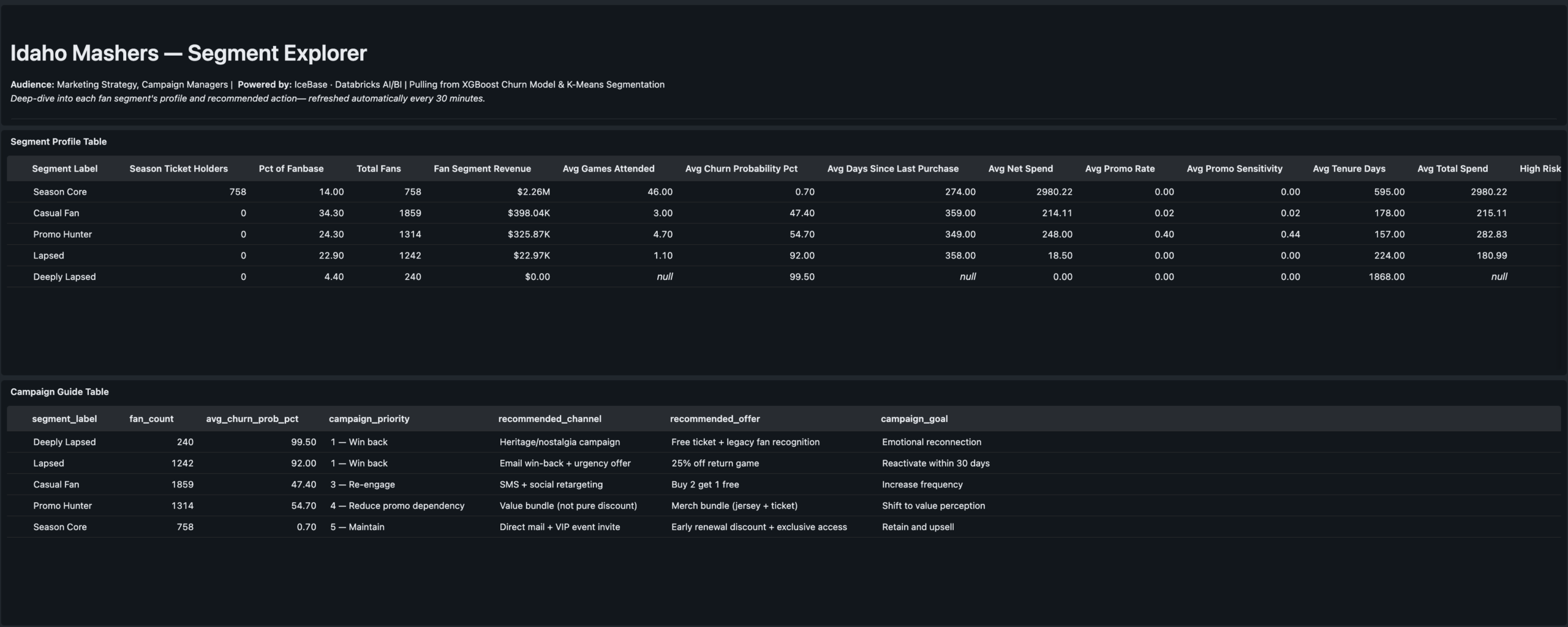
Segment profiles · Channel quality · Campaign action guide table

Results
The stat sheet
5 phases
End-to-End Delivery
Seed data through ML-powered dashboards. Phase 6 SQL Alerts designed and deferred to next cycle.
0.94 AUC
Churn Model Performance
XGBoost churn predictor after catching and correcting data leakage from recency_days feature.
5 clusters
Fan Segments
K-Means on RFM + behavioral features. Labels assigned manually by reading centroid profiles — practitioner judgment step.
3 dashboards
AI/BI Serving Layer
Fan Health · Revenue Ops · Segment Explorer. Each one answers exactly one executive’s questions.
82 games
Full Season Modeled
5,000 fans · 47k+ ticket transactions · 4 season phases · Jersey Night event modeled as game 77.
6 notebooks
Lakeflow Pipeline
4 SQL + 2 Python. Single-language notebooks required by Lakeflow — language split is intentional and documented.
4 tasks
Job DAG
Silver pipeline → customer_360 + game_revenue in parallel → retention_cohort. Runs every 30 minutes on schedule.
Free tier
Databricks Free Edition
Full Unity Catalog, Lakeflow, MLflow, and AI/BI Dashboards on Databricks Free Edition with serverless compute.
Engineering Decisions
Key decisions &
tradeoffs
The choices that shaped the architecture — and what was knowingly accepted or given up at each step.
| Decision | Rationale | Tradeoff |
|---|---|---|
| Authored narrative over random data | Random seed data produces technically correct pipelines but tells no business story. The PHASE_WEIGHTS configuration object encodes fill rate, price multiplier, promo rate, and acquisition volume for each game range — making every downstream number explainable to a CMO, not just a data engineer. | More build time upfront — designing the narrative before generating a single row added significant design work. Paid for itself in the quality of the ML validation and dashboard storytelling. |
| 6-notebook pipeline with language split | Lakeflow pipeline source files must be single-language — SQL or Python, not both. The split is intentional: SQL for single-source tables and materialized views (cleaner, more readable), Python where two independent readStreams need to be unioned — which SQL cannot express cleanly. | Correct implementation — attempting mixed-language notebooks was the first approach and failed. The 6-notebook solution reflects how Databricks Lakeflow actually works, not how older DLT documentation implied it worked. |
| Quarantine table over silent drops | Most pipeline tutorials drop bad records and move on. Routing them to a named quarantine table means bad data is preserved for investigation, the pipeline event log shows exactly how many records failed each expectation, and a SQL Alert can fire when the count spikes. | Production pattern — adds one more streaming table to manage, but the observability gain is significant. This is the pattern a senior data engineer would reach for in a real org. |
| Remove recency_days from churn model | Initial XGBoost training produced AUC of 1.0 — the signal that something was wrong. recency_days is mathematically derived from churn_flag (no purchase in 45+ days). Leaving it in the model means the model learns a tautology, not fan behavior. Removing it produced a real 0.94 AUC. | Honest model — 0.94 AUC on clean behavioral features is a genuinely strong result. The leakage catch and fix is a stronger portfolio signal than a perfect 1.0 would have been. |
| Champion alias over versioned model staging | Unity Catalog replaced the old Staging/Production stage model with named aliases. Setting a “champion” alias on the registered model means downstream scoring notebooks reference @champion — not a version number. Promoting a retrained model requires updating the alias pointer, not changing any code. |
Alias documentation required — anyone unfamiliar with the UC alias pattern needs context. Accepted in exchange for a promotion workflow that doesn’t require code changes in scoring notebooks. |
| Three dashboards over one unified report | The CMO, VP Revenue, and Marketing Strategy leads ask fundamentally different questions. A unified dashboard forces cognitive filtering that reduces adoption. One persona per dashboard is a product decision — each dashboard is structured around exactly one executive’s mental model of the data. | More build and maintenance surface — three dashboards to update when the Gold schema evolves. Accepted as the correct product tradeoff for usability and stakeholder clarity. |
Gallery
Screenshot gallery
Every pipeline artifact, ML experiment, and dashboard view from the live Databricks workspace.
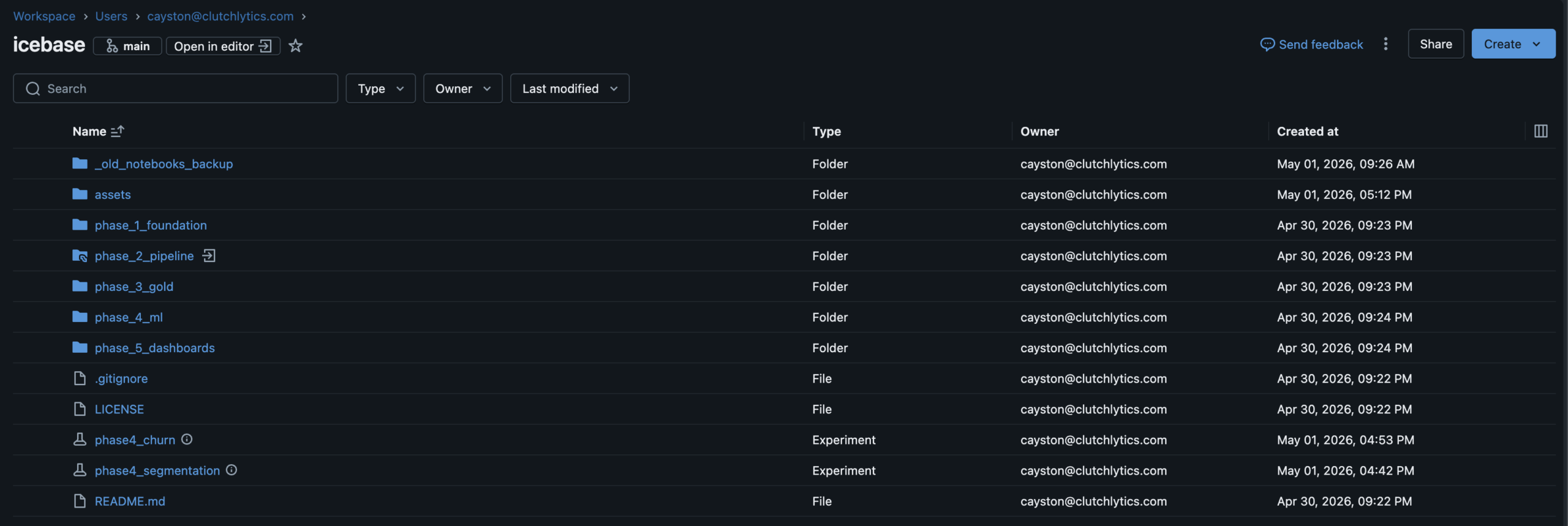
Databricks WorkspaceFull project workspace · Phase folder structure · GitHub Repos connected
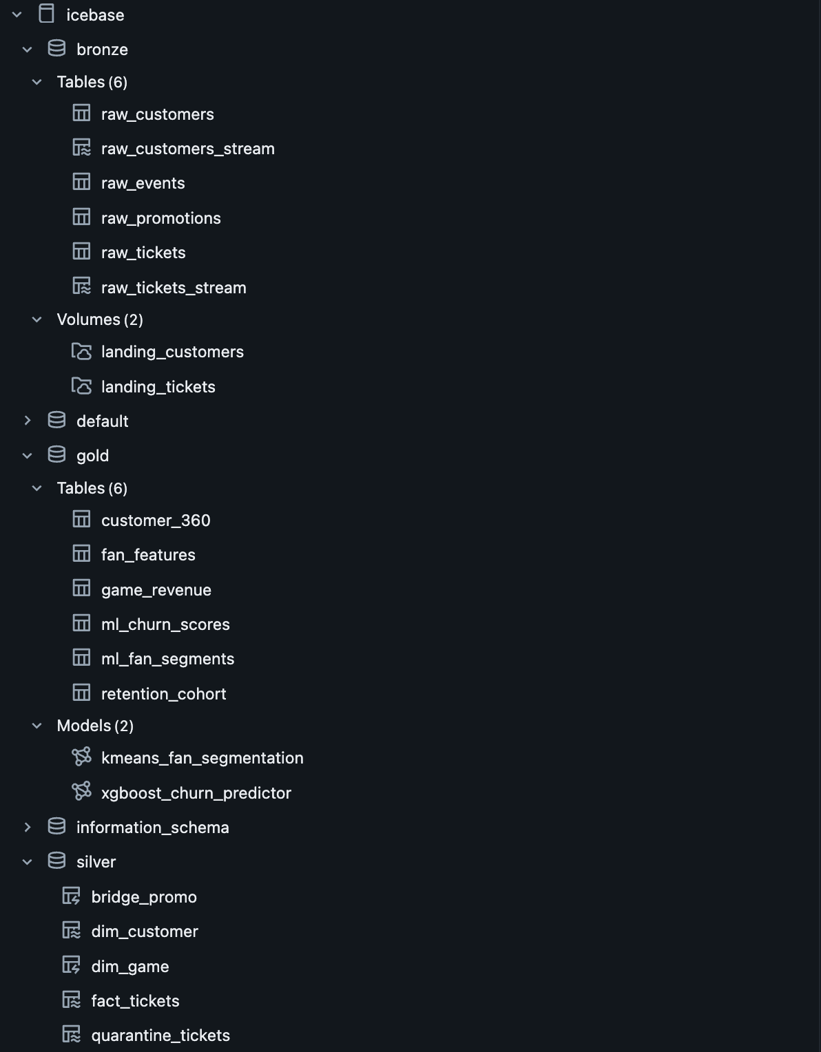
Unity Catalogicebase.(bronze|silver|gold) · ML models registered alongside tables
Lakeflow Pipeline DAGBronze→Silver declarative pipeline · 6 source files · Dependency graph resolved by runtime
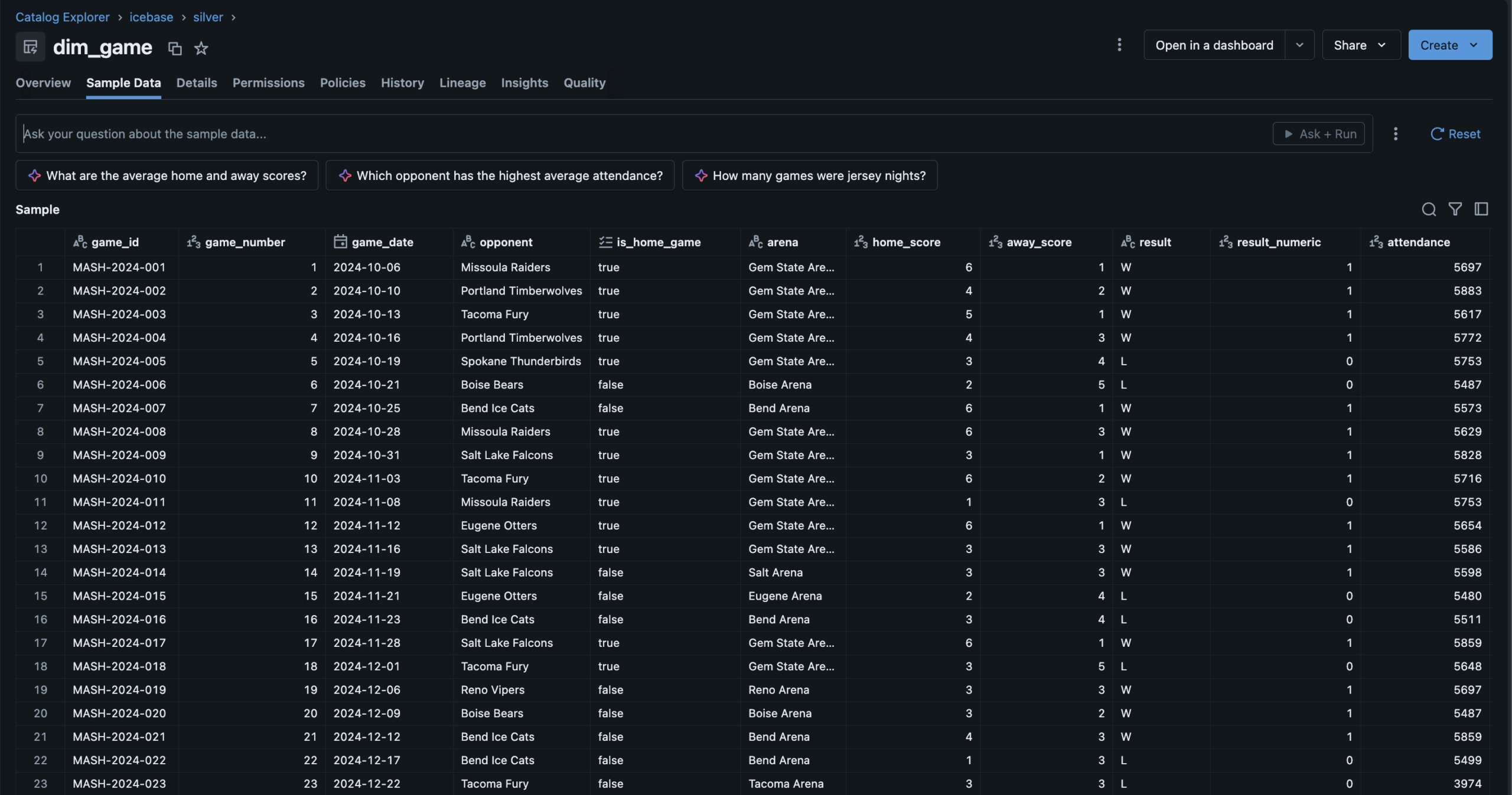
Silver — dim_game82 games · Derived columns: result_numeric, is_playoff_relevant, wins_to_date
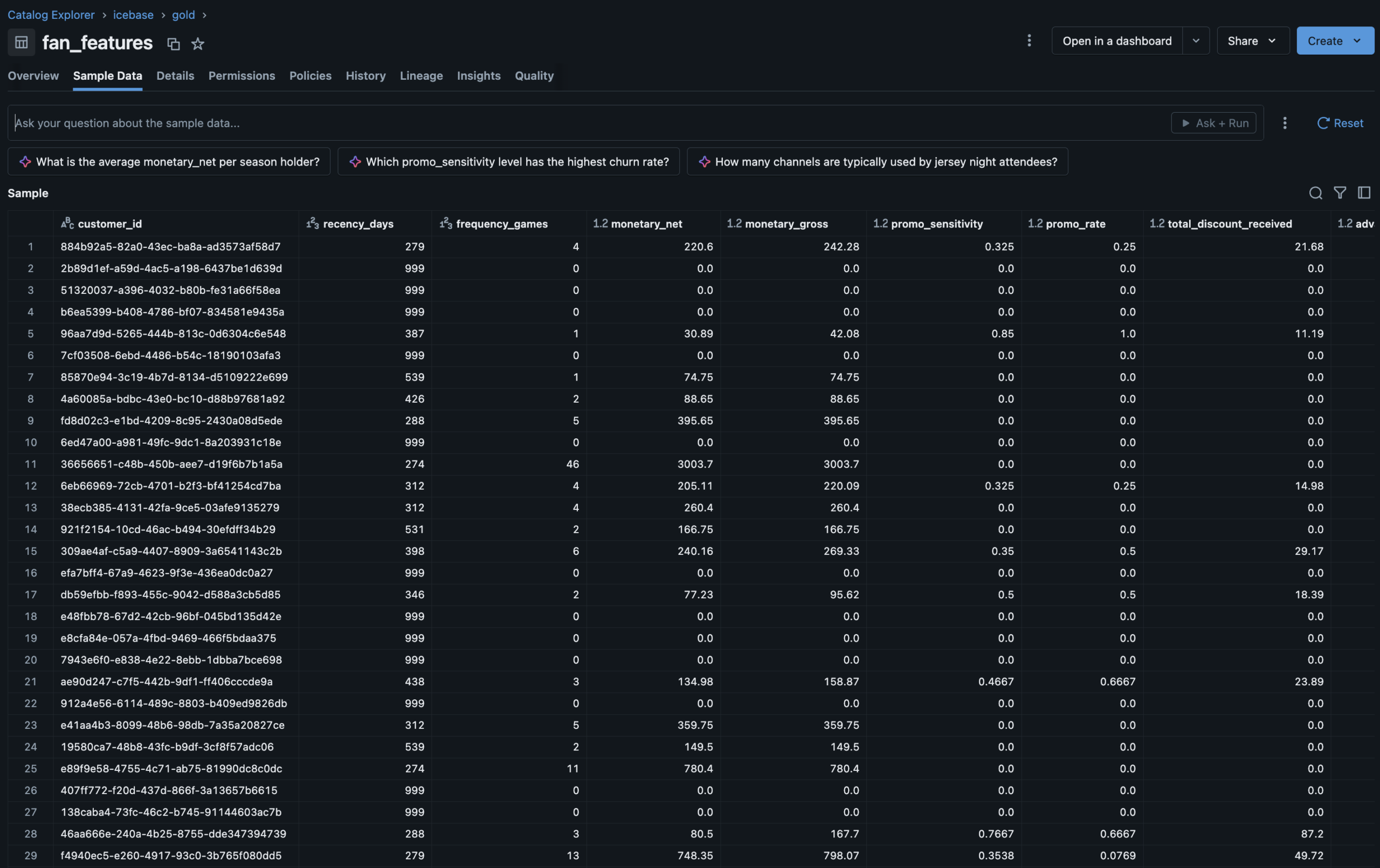
Gold — fan_featuresUnity Catalog Feature Table · RFM + behavioral features · ML training ground
Lakeflow Job DAG4-task orchestrator · Parallel branches · Silver → Gold → ML · 30-min schedule
Job Run HistoryAll tasks succeeded · Pipeline automation confirmed end to end
MLflow ExperimentsElbow analysis + XGBoost churn run · Parameters, AUC, confusion matrix, feature importance
UC Model Registryxgboost_churn_predictor · @champion alias · Feature lineage tab shows fan_features source
Fan Health DashboardChurn risk distribution · High-risk watchlist · Jersey Night cohort comparison
Revenue OperationsSeason revenue arc · Jersey Night spike · Promo cost by phase · Fill rate trend
Segment ExplorerSegment profiles · Channel quality cross-tab · Campaign action guide
ESC · CLOSE
Data Readiness
Technical PM · Roadmapping
📋 TPM Lead
Professional
🔒 Anonymized
Data Readiness
Scoping, Roadmap
& Execution
Led the full project lifecycle for a data infrastructure readiness initiative — audit facilitation, gap analysis, V1/V2 scoping, roadmap build, and sprint execution — delivering a clean room–ready dataset across five sprints with a 90% average burndown and every MVP workstream delivered on time.
🔒 Anonymized from a real professional engagement
This case study is drawn directly from professional TPM work at an enterprise data platform serving collegiate sports properties. Workstream names, system references, and client details have been genericized to protect proprietary infrastructure. The scope, story point scale, sprint cadence, burndown metrics, and prioritization framework shown here reflect the actual project.
Technical PMRoadmappingAgile / ScrumData InfrastructureIdentity ResolutionClean Room ReadinessV1/V2 PrioritizationSprint Execution
The Problem
The data existed.
The trust in it didn't.
Integrating fan data into a clean room environment — where identity resolution, audience matching, and attribute modeling happen at scale — requires the upstream data to meet a standard that most organizations haven't formally defined, let alone achieved.
The team had data. Ticketing records, customer attributes, digital identifiers, third-party appends. But the data lived across pipelines with inconsistent quality standards, unresolved match logic, fragmented attribute governance, and no shared definition of what “ready” even meant for a clean room integration.
Nobody had audited the current state end to end. Engineering knew individual systems were imperfect. But there was no cross-workstream view of what needed to change, in what order, and what could wait for a v2 refactor without blocking the business deadline.
The project started before there was a project. The first job was facilitating an engineering audit, translating those findings into a scoped backlog, and then building the roadmap that turned a business deadline into a sequenced, deliverable plan.
Gap 01 · No Audit BaselineNo cross-workstream assessment of current data quality existed. Each engineering team had local knowledge of their domain’s issues. No one had the full map.
Gap 02 · Undefined “Ready”Clean room readiness had no formal definition. Without a clear acceptance standard, engineering couldn't scope toward it and stakeholders couldn't validate against it.
Gap 03 · No V1/V2 FrameworkEvery identified issue was treated as equally urgent. There was no framework for distinguishing what had to be fixed before the business deadline vs what should be refactored properly in a future sprint.
Gap 04 · No Delivery OwnershipThe engineering team had the technical skills to execute the work. What was missing was a PM owner to sequence it, track it, manage dependencies, and hold the burndown accountable across sprints.
My Role
TPM lead —
not the engineer.
📋What I Led
- Facilitated the engineering audit — structured the audit process across all identified workstreams, gathered findings from engineering, and consolidated into a cross-workstream gap analysis
- Translated audit findings into a scoped backlog — converted raw engineering observations into properly defined tickets with acceptance criteria, effort estimates, and dependency flags
- Built the V1/V2 prioritization framework — defined the decision criteria for what made MVP (business deadline, clean room dependency) vs what was deferred to a v2 refactor
- Built the phased roadmap — sequenced all V1 workstreams across five sprints on a custom story point scale that normalized team capacity and accommodated all other DSA team work simultaneously
- Led sprint execution across all five sprints — ran standups, managed blockers, tracked burndown, and adjusted sequencing as dependencies resolved or shifted
- Delivered all V1 workstreams on time against the business deadline with a 90% average sprint burndown across the project lifecycle
🔬Scope Boundary
This is the most important clarity on this project: I was the TPM, not the engineer or analyst. The distinction matters because the value I added was organizational and structural, not technical.
- I did not write the SQL, Python, or pipeline code — engineering executed all technical workstreams. My job was to make sure they were building the right things in the right order.
- I did not conduct the data audits — I facilitated them. I defined the audit framework, asked the questions, and translated the answers into actionable scope.
- I did not set the business deadline — I scoped to it. The clean room integration timeline was a business constraint. My job was to fit the necessary work inside it without sacrificing correctness.
- I did own the V1/V2 call — the decision about what was MVP vs deferred was a product and PM judgment, not a technical one. That’s where project management crossed into product thinking.
Not in scope for this role
Technical development · Data analysis · System architecture design · Clean room platform configuration
The Approach
Audit first.
Then scope. Then ship.
Five stages — the sequence mattered as much as the work. Starting with execution before the audit was complete would have built the wrong things.
01Audit FacilitationStructured a cross-workstream engineering audit covering identity matching, data appends, attribute governance, and pipeline health.
02Gap AnalysisConsolidated audit findings into a cross-workstream gap map — graded by severity, business impact, and clean room dependency.
03V1/V2 ScopingApplied the V1/V2 prioritization framework — separating what had to ship before the deadline from what should be refactored properly in a future cycle.
04Roadmap BuildSequenced all V1 workstreams across five sprints on a normalized story point scale — respecting team capacity, dependencies, and parallel DSA work.
05Sprint ExecutionLed five delivery sprints — standups, blocker management, burndown tracking, and sequencing adjustments as the project progressed.
Workstream Decomposition
What was scoped.
What made V1.
Every identified workstream from the audit — classified by layer, story point estimate, and V1 vs V2 designation. Orange top bar = V1 MVP. Gray = deferred to V2.
Customer Analytics UpdateV1
Identity · Analytics Layer
Update existing customer analytics SQL logic to align with new identity standards and clean room acceptance criteria. Targeted fix — not a full refactor — to meet deadline while preserving existing structure.
~30 pts · Sprint 1–2
RampID BackfillV1
Identity Resolution · BigQuery
Backfill RampID values across the customer dataset in BigQuery to ensure clean room identity matching has full coverage. Hard dependency for LiveRamp integration — nothing ships without this.
~40 pts · Sprint 1–3
Match Quality ValidationV1
Identity · Match Logic
Identify and exclude records flagged as low-confidence or erroneous matches from the customer match process. Ensures the clean room dataset reflects genuine identity resolution rather than noise from bad match candidates.
~25 pts · Sprint 2
Golden Record Attribute RollupV1
Attribute Modeling · Single Source
Consolidate multi-source customer attributes into a single authoritative record per customer ID. Resolve conflicts between source systems using a defined precedence hierarchy — the foundation of consistent attribute modeling downstream.
~35 pts · Sprint 2–3
Data Ingestion Pipeline RebuildV1
Pipeline · Ingestion Layer
Rebuild the core data ingestion pipelines identified as fragile or undocumented during the audit. V1 scope targets the pipelines with direct clean room data flow dependency — not a full platform rebuild.
~45 pts · Sprint 3–4
Data Append Pipeline RebuildV1
Pipeline · Third-Party Appends
Rebuild the third-party data append pipelines to resolve identified fragility and ensure append quality standards meet clean room input requirements. Scoped to append sources that directly affect identity resolution coverage.
~40 pts · Sprint 4–5
Customer Analytics RefactorV2
Analytics Layer · Full Refactor
Complete architectural refactor of customer analytics SQL — not a targeted update but a ground-up rebuild to the new standard. Deferred because the V1 update delivers clean room readiness without requiring the full rebuild on the business deadline timeline.
~50+ pts · Future cycle
Digital Notebook RefactorV2
Analytics · Engineering Tooling
Refactor data science notebooks used for digital analytics to align with updated pipeline outputs and attribute standards. Deferred because notebooks are analytical tooling, not clean room input — can be updated in V2 without blocking the MVP release.
~35+ pts · Future cycle
Additional V2 WorkstreamsV2
Platform · Infrastructure
Additional platform improvements, pipeline optimizations, and attribute modeling enhancements identified during the audit as improvements rather than MVP requirements. Captured in the backlog for V2 planning.
~80+ pts · Future cycle
V1 MVP — delivered on deadline
V2 Deferred — backlogged for future cycle
~250 total story points · V1 scope only
Prioritization Framework
The V1 vs V2
decision matrix
The product thinking behind the PM execution. Not every identified issue was equally urgent — the V1/V2 call was made on two dimensions: how critical the workstream was to clean room readiness, and how deep a fix was technically required.
V1 vs V2 Prioritization MatrixClean Room Dependency vs Technical Refactor Depth
TPM Decision Framework
Sprint Execution
Five sprints.
All V1 workstreams delivered.
Workstream sequencing across five two-week sprints — story point distribution, primary focus per sprint, and the 90% average burndown across the full project lifecycle.
Sprint Roadmap & Burndown5 Sprints · ~250 Story Points · 90% Avg Burndown · All V1 Delivered
Includes All DSA Team Work
Results
The stat sheet
5 sprintsFull Delivery LifecycleFive two-week sprints from audit facilitation to final V1 clean room–ready dataset delivery against the business deadline.
250+ ptsStory Points DeliveredAcross all V1 workstreams on a custom normalized story point scale designed to fit the DSA team’s capacity model and two-week sprint cadence.
90%Avg Sprint Burndown90% average burndown across five sprints — including all other DSA team work running in parallel, not just data readiness workstreams.
100%V1 Scope On TimeAll MVP workstreams delivered on the business deadline. V2 workstreams captured in the backlog for future cycle planning as designed.
TPM + Product Lens
Key decisions & tradeoffs
Where project management and product thinking overlapped — and where the hardest calls were made.
| Decision | Rationale | Tradeoff |
|---|---|---|
| Update in V1, refactor in V2 | The single most consequential product decision in the project. Customer analytics could be updated to meet clean room acceptance criteria in V1 — or it could be refactored properly. A full refactor was the right long-term answer. But it was a 50+ point workstream that would have missed the business deadline. The V1 update was 30 points, delivered the same business outcome, and preserved the refactor for a future sprint where it could be done correctly. | Technical debt accepted — the V1 update leaves the underlying architecture in a state that still needs a full refactor. This was an explicit, documented tradeoff, not an oversight. The V2 backlog item was written with the context of why it was deferred, not just that it was. |
| Audit before scoping | It would have been faster to start scoping and building immediately. Several workstreams felt obvious before the audit. But without a structured cross-workstream audit, the scope would have been incomplete — some issues wouldn't have surfaced until mid-execution, which is the most expensive time to discover them. The audit phase added two weeks upfront and saved more than that downstream. | Cleaner scope, fewer surprises — the audit surfaced dependencies and sequencing constraints that wouldn't have been visible from the top. The RampID backfill, for example, turned out to be a dependency for multiple other workstreams — knowing that before Sprint 1 changed the entire sequence. |
| Normalize story points to team capacity | The DSA team ran this project in parallel with all other sprint work. Using a custom normalized story point scale — rather than absolute hours or standard Fibonacci points — let the roadmap reflect realistic team velocity without artificially separating data readiness work from the rest of the sprint. A 90% burndown across mixed-workload sprints is a more honest metric than a 100% burndown on an isolated project. | Harder to explain externally — a custom scale is less immediately legible to stakeholders unfamiliar with the team's velocity model. Tradeoff accepted in exchange for a planning model that actually reflected how the team worked, not one that looked cleaner but misrepresented capacity. |
| Facilitate the audit, don’t own it | The engineering team had the technical depth to assess their own systems. My role was to structure that assessment, ask the right questions, and ensure findings were complete and comparable across workstreams — not to conduct the audits myself. Attempting to own the technical audits would have slowed them down and produced less accurate findings. Facilitating them produced better results faster. | Higher-quality findings — domain experts auditing their own systems find more than a PM auditing systems they don't own. The TPM value was in the structure of the audit, the consolidation of findings, and the translation into scope — not in having the most technical knowledge in the room. |
PinSeeker Golf Analytics
Data Engineering · Analytics
🏗 Architect + 🔬 Analyst + 📋 Product Owner
◆ Independent Project
⛳ Personal Use · Blog & Analysis
PinSeeker —
Golf Analytics
Operating System
A fully personal golf analytics system built to answer my own questions better — a MySQL medallion warehouse fed by the DataGolf API, a custom player identity engine with 5 branded archetypes, a multi-layer prediction stack, a DFS intelligence layer, and an 8-page Streamlit app designed as my weekly operating surface for tournament analysis and blog content. Not a product. A point of view, backed by a real system.
⛳ Personal Use · Non-Commercial
PinSeeker is built for my own weekly golf analysis workflow — not for distribution, sale, or external users. It powers my tournament previews, DFS decision process, Pick6 selections, and blog content. Every architectural decision was made to serve one user: me. That constraint is what makes it a genuine data engineering and product thinking exercise — not a demo, but a working system I actually depend on every tournament week during the PGA Tour season.
MySQLPythonStreamlitDataGolf APIMedallion ArchitecturePrediction ModelingDFS OptimizationPlayer Identity EngineMac cron automation
The Problem
Golf analytics that
reflects how I think.
The publicly available golf analytics tools are either too surface-level for serious weekly analysis or too generic to reflect any individual point of view. I wanted something that thought about golf the way I do.
Existing feeds like DataGolf provide strong statistical baselines — but they don't have my opinion layered on top. They don't know that I weight course fit differently for a major. They don't have my archetype taxonomy. They don't generate my Pick6 line estimates or build lineups using my leverage philosophy.
More practically: I was spending tournament weeks jumping between five different tools with no single surface connecting my player profiles to my predictions, my DFS stack, and my content workflow.
PinSeeker is the system I built so I never have to do that again. One warehouse. One app. My own analytical layer on top of the best available data.
Gap 01 · No Identity LayerNo existing tool let me define and apply my own player archetypes as first-class model inputs driving predictions, DFS scoring, and content from the same taxonomy.
Gap 02 · Disconnected WorkflowsTournament previews, Pick6 decisions, DFS lineup building, and post-event review all lived in separate places with no shared context or data lineage.
Gap 03 · Generic PredictionsAvailable tools surface raw probabilities but have no mechanism for a personal opinion layer — no archetype adjustments, no versioned rule sets, no traceability.
Gap 04 · No Evaluation LoopNothing tracked how good my predictions actually were — no weekly scorecard, no season-level model comparison, no disciplined way to know what to tune.
My Role
Every layer. One person.
🏗What I Designed & Built
- Designed the full MySQL medallion warehouse — Bronze (raw API), Silver (clean/structured), Gold (analytics-ready), plus ops and models schemas. 14+ active DDL files in the 2026 rebuild.
- Built all Python ETL pipelines from the DataGolf API — automated via Mac cron for live tournament refreshes and pre-tournament pulls
- Created the PinSeeker Player Identity System — 5 branded archetypes, 12 trait tags, 6 analyst flags — versioned, scored, append-only history
- Built the full prediction stack — tournament outcomes (win/top10/cut), round-level scoring, stat predictions (birdies, pars, bogeys, eagles) with PinSeeker rule layers on top of DataGolf baselines
- Designed the DFS intelligence layer — 60/40 source/PinSeeker projection blend, archetype-aware rule engine, lineup optimizers for all DraftKings slates
- Built the Pick6 decision engine — PinSeeker-generated lines and over/under probabilities without depending on bookmaker lines
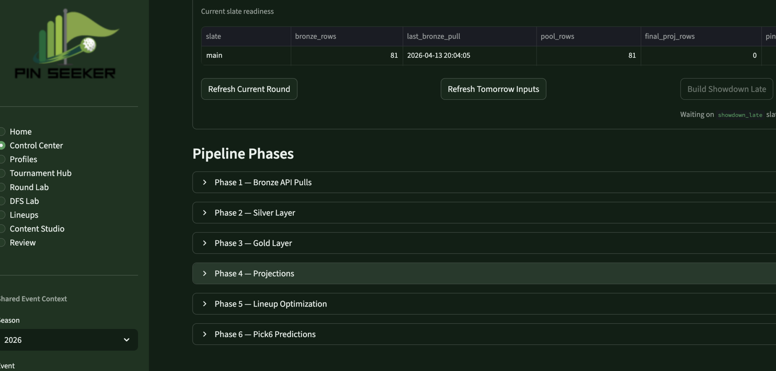
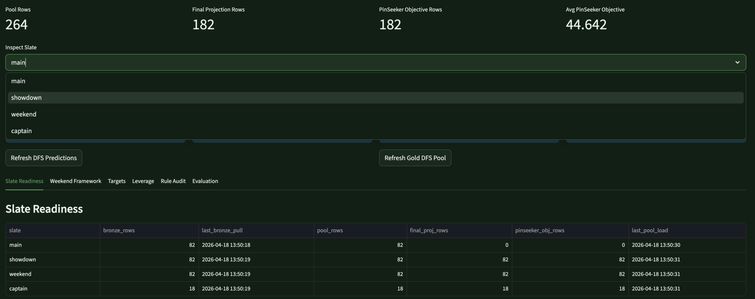
- Built the 8-page Streamlit app — weekly operating system: Home, Control Center, Profiles, Tournament Hub, Round Lab, DFS Lab, Lineups, Review
- Designed the evaluation framework — Brier score, MAE, calibration tracking, model version comparison across all prediction families
📋Product Philosophy
- Built for one user — every UX decision, every data model choice, every archetype definition reflects my own analytical framework, not a market of users
- Versioned and auditable throughout — every prediction family ties to a model run ID, every rule adjustment is traceable, every profile snapshot is append-only history
- Backend-first, app second — the warehouse was kept mature before the app was redesigned; the app is a surface over the data, not a logic engine
- Iterative by design — new archetype rules, Masters special event modes, and prediction tuning are treated as versioned business logic changes, not ad hoc overrides
- Personally operated weekly — I refresh it, run it, review it, and tune it every tournament week during the PGA Tour season
- Content-ready — a dedicated Content Studio page surfaces talking points, blog prep notes, and insight cards directly from the live warehouse
The Approach
A weekly operating
sequence, not a script
Five layers — each cleanly separated so predictions, identity, and decisions all come from the same source of truth.
01PipelineAutomated DataGolf API pulls load Bronze on cron. Silver standardizes. Gold builds analytics-ready facts and views.
02ProfilesEvery active player gets a PinSeeker archetype and trait tags, scored against versioned component formulas — updated weekly.
03PredictTournament outcomes, round scores, and stat lines modeled — DataGolf baseline blended with PinSeeker archetype-based rule adjustments.
04DecideDFS lineups built using blended projection stack. Pick6 lines generated from round-stat model. App surfaces everything in one flow.
05ReviewPost-event evaluation runs automatically — Brier scores, MAE, model version comparison, scorecards for every prediction family.
The Stack
Tools & system design
Five core technologies and a full system diagram showing how data flows from the API through the warehouse to the app decision surfaces.


⛳DataGolf APISource of truth — predictions, live scoring, decomposition, DFS projections
⏳Mac CronAutomated pipeline scheduling — live refreshes during tournament rounds
PinSeeker System ArchitectureDataGolf API → Medallion Warehouse → Prediction Stack → App Decision Surfaces
2026 Rebuild
Player Identity System
Five archetypes.
My own taxonomy.
Every active PGA Tour player gets a primary archetype weekly — scored against versioned component formulas, stored as append-only history. These flow into predictions, DFS scoring, content framing, and lineup logic. They're the thing that makes PinSeeker distinctly mine.
👑The HeadlinerHigh-class, well-rounded. True top-end finish equity. Win probability boost + strong placement support.
🎯The Stripe ShowBall-striking-led. OTT and approach-driven ceiling. Scoring and upside boost. Moderate leverage premium.
🔧The ScramblerShort-game survival. ARG, putting, damage control. Cut-making and top-25 support. Lighter win ceiling.
⚡The FirecrackerHigh-variance scorer. Birdie spikes, boom/bust. Strong win and GPP boost with deliberate downside tolerance.
🎱The MetronomeStable, accurate, low-volatility. Avoids big mistakes. Consistency and cut-making reward, reduced win ceiling.
Also tagged with 12 trait descriptors + 6 weekly analyst flags:
Birdie SurgeBogey ResistantGPP CeilingDFS CorePick6 FriendlyCourse HorseShowdown FriendlyForm-Driven ValueFast StarterStrong CloserCut RiskDifficult-Course Fit
Weekly flags: Analyst Boost · Analyst Fade · Ownership Trap · Weather Upgrade/Downgrade · Major Week Upgrade
The Output
Eight pages. One weekly flow.
The Streamlit app is the operating surface I actually use every tournament week — not a demo. It runs locally, reads from the live warehouse, and moves me through the full decision sequence in one place.
 Control CenterPipeline MgmtRefresh controls · run logs · freshness
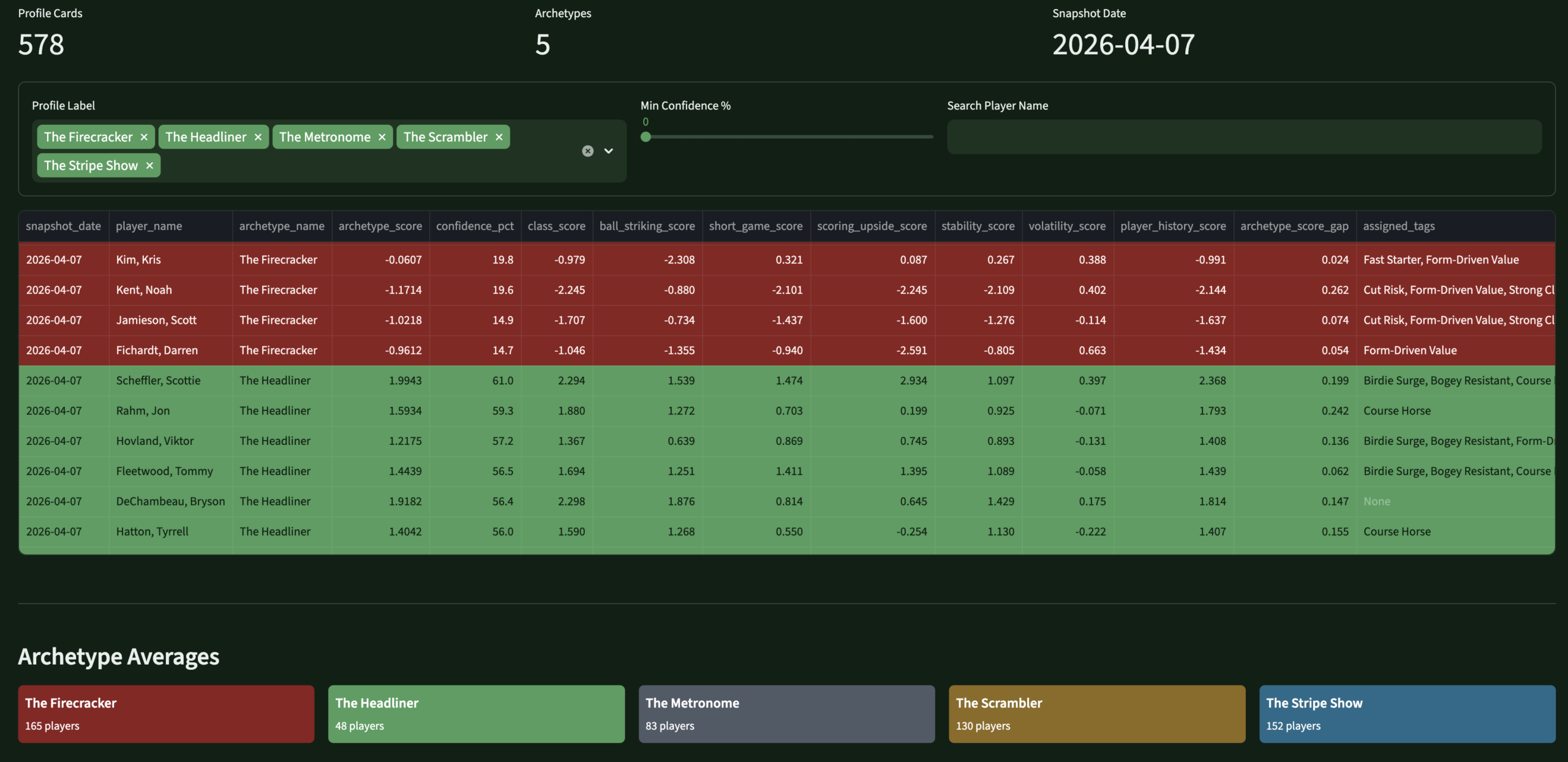 ProfilesPlayer IdentityArchetypes · tags · component scores
 DFS LabDFS OptimizerTarget · fade · leverage · projections
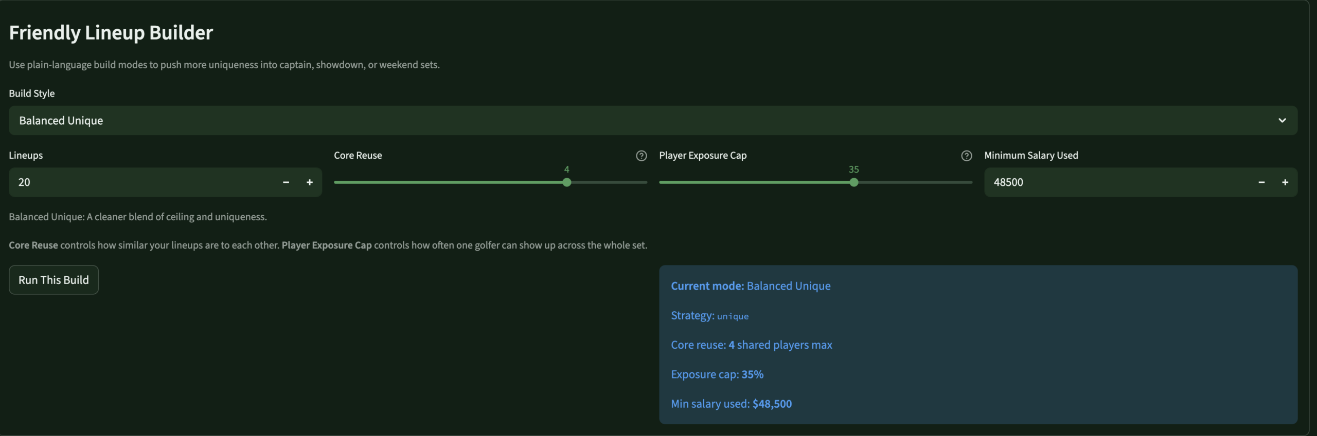 LineupsLineup BuilderOptimizer controls · slate · exposure
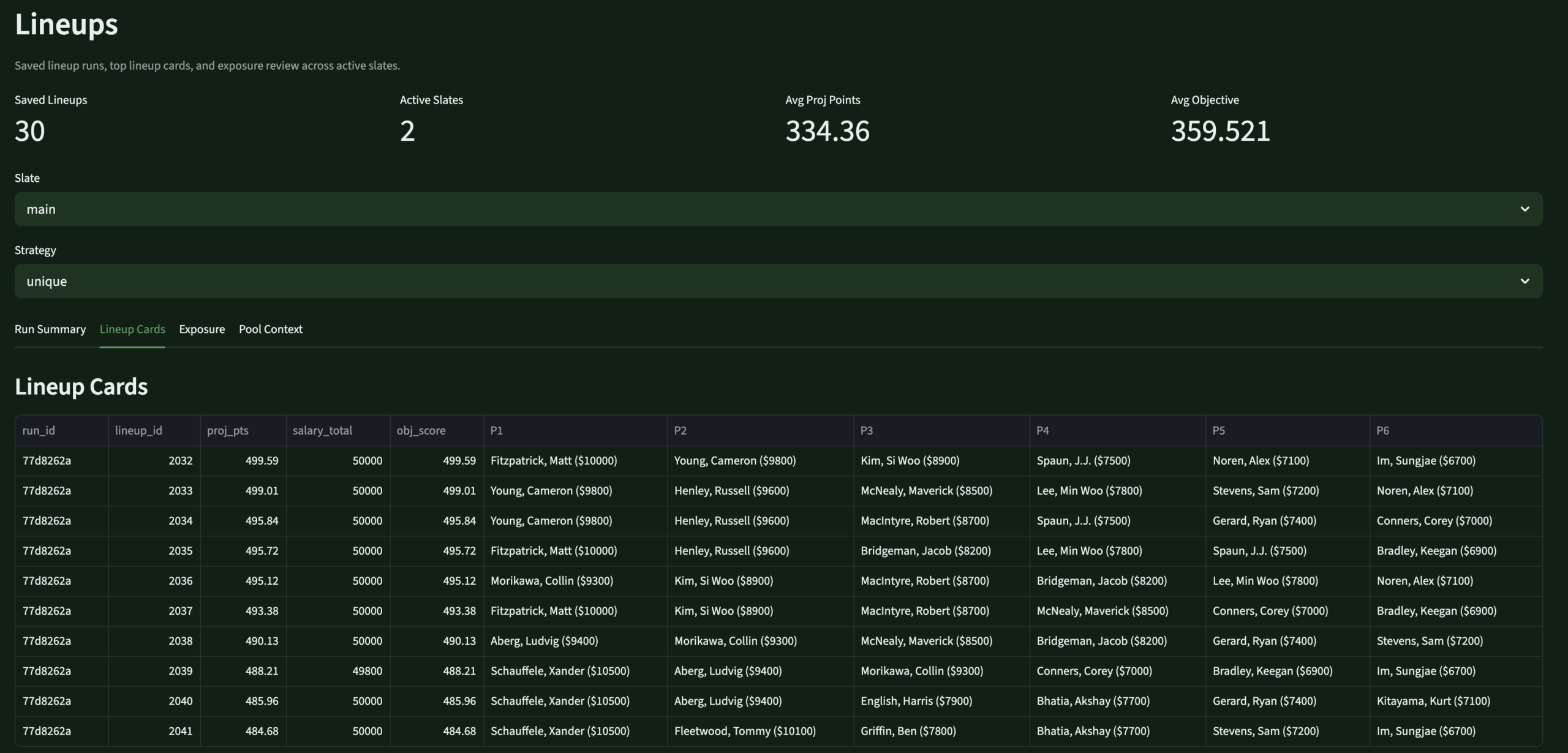 LineupsLineup ReviewSaved lineups · usage · exposure
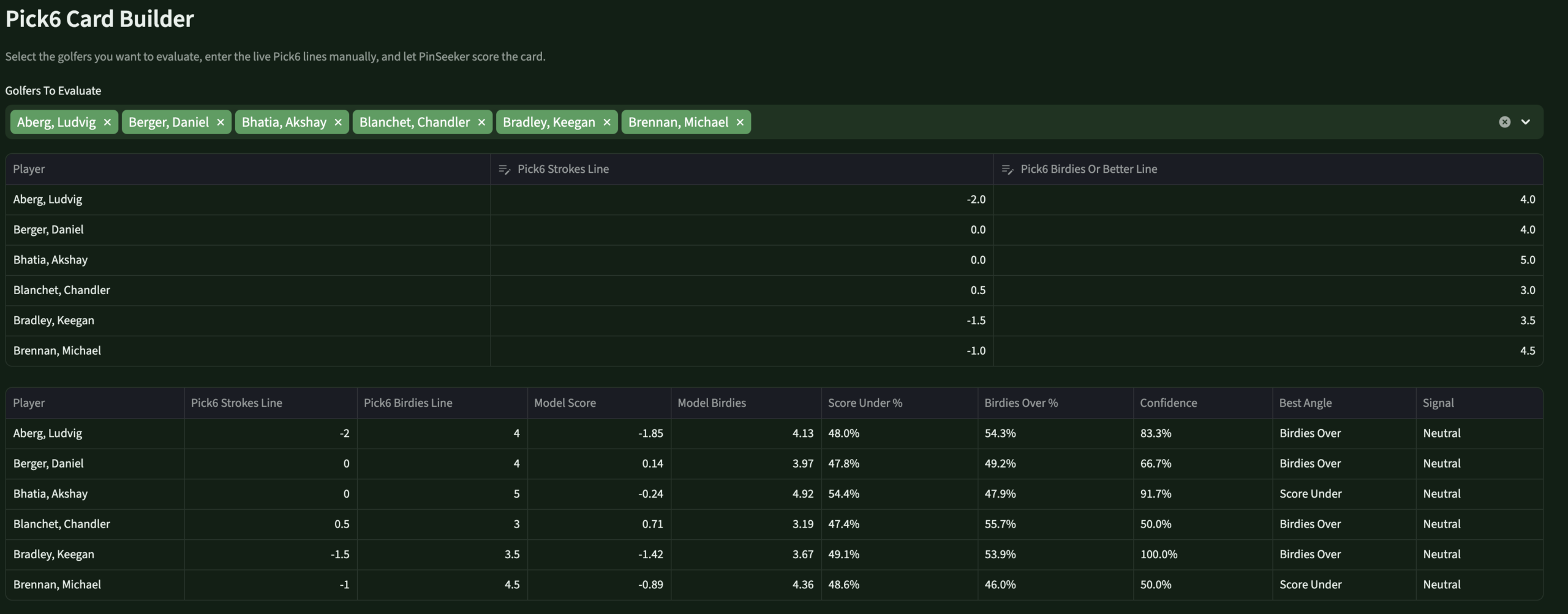 Round LabPick6 EnginePS lines · birdies/pars · over/under
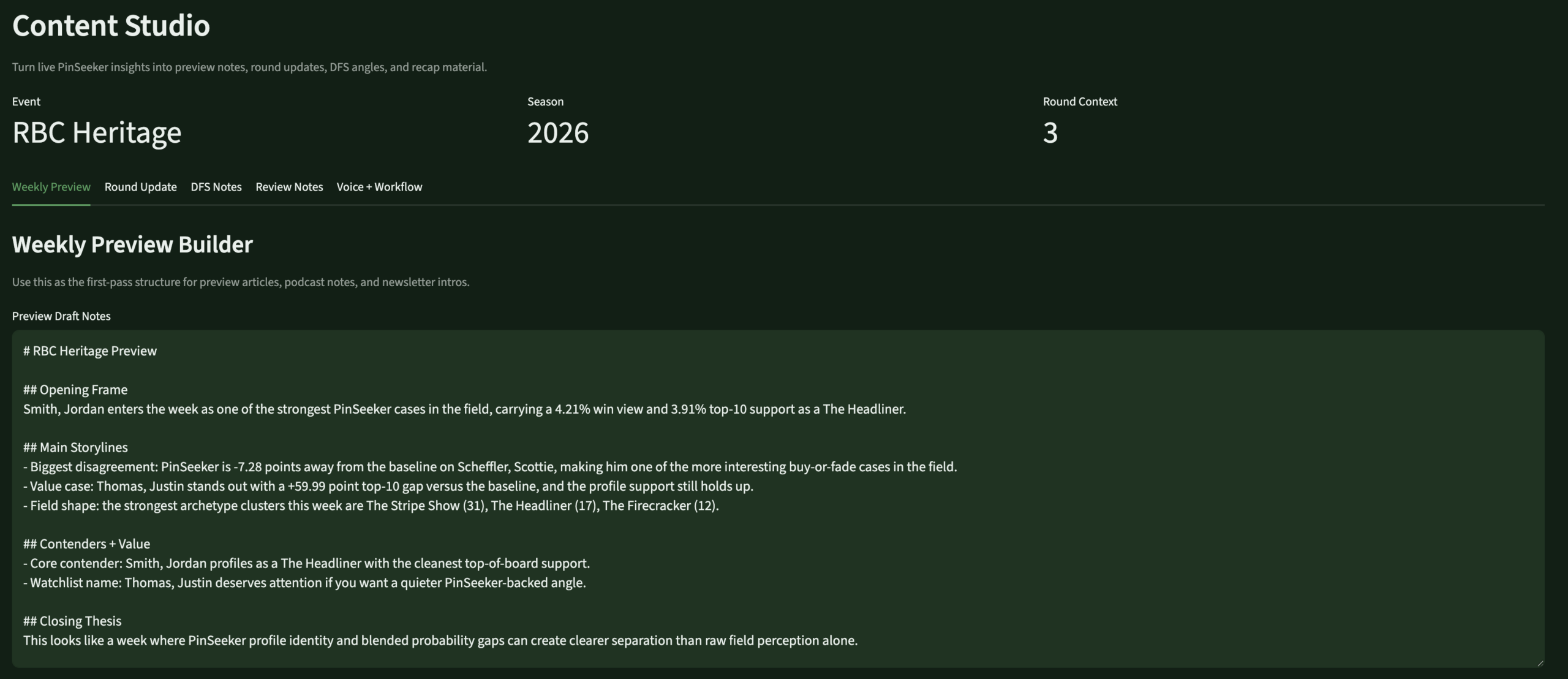 Content StudioContent EngineTalking points · blog prep · insights
Review – PendingReviewEvaluationBrier · MAE · model scorecards
Scale
The stat sheet
14+Active DDL FilesFull 2026 warehouse rebuild across Bronze, Silver, Gold, ops, and models schemas.
5 famPrediction FamiliesTournament, round scoring, birdies/pars/bogeys/eagles — each with raw, DG-blended, and PinSeeker-adjusted outputs.
8 pgApp PagesHome, Control Center, Profiles, Tournament Hub, Round Lab, DFS Lab, Lineups, Review.
7 sigMasters Special Mode7 Augusta-specific bonus signals, tiered pool support, DFS overlay — without touching the standard weekly process.
Builder's Lens
Key decisions & tradeoffs
The architectural choices that shaped PinSeeker — and what building for yourself, rather than for a market, changes about each one.
| Decision | Rationale | Tradeoff |
|---|---|---|
| Personal use only | Building for one real user — myself — forced every design decision to be genuinely useful rather than impressive. There's no “will users understand this?” question. If it works for my workflow, it ships. | Maximum relevance — every feature exists because I actually needed it. The evaluation framework exists because I genuinely want to know if I was right, not because it demos well. |
| Backend-first, app second | The warehouse was kept mature before the app was redesigned. Full medallion architecture, versioned logic, auditable predictions — all in place before the Streamlit surface was rebuilt. | Slower to usable UI — months of warehouse work before the app felt right. The right tradeoff: an app over messy data would have been worse than no app. |
| Versioned rule layers | Every prediction adjustment is versioned, stored, and auditable. I can trace exactly what changed for any prediction in any week. A black-box system is unimprovable. | More engineering overhead — faster to hardcode. But versioned rules are the only way to know if the system is actually getting better. |
| 60/40 DFS blend | Rather than fully trusting external DFS projections or overriding them entirely, the stack blends 60% source with 40% PinSeeker-generated projection. My opinion matters without discarding a strong baseline. | Testable — the evaluation framework compares source-only, PinSeeker-only, and blended MAE. I'll know if the ratio should shift after a full season. |
| Pick6 without book lines | DraftKings Pick6 lines aren't reliably available in advance. PinSeeker generates its own best line and uses those as the reference for over/under probabilities — useful whether or not an actual line ever shows up. | No edge confirmation — I can't say “PinSeeker is 15% above the market” without a market line. But knowing what PinSeeker would set reveals where my model is extreme — the actual decision surface. |
| Masters special mode | The Masters requires fundamentally different prediction logic. Rather than patching the standard weekly process, a dedicated overlay layer sits on top without touching base outputs — preserving everything and adding Augusta-specific signals cleanly. | Reusable for all majors — the event mode architecture (standard / masters_major_mode / pga_major_mode) extends cleanly to every major. Building it right once is cheaper than rebuilding four times a year. |
Gallery
Screenshot gallery
The app in operation — every page from the weekly workflow. Click any screenshot to expand.
Control CenterPipeline refresh controls · run logs · data freshness
Player ProfilesArchetypes · tags · component scores · analyst flags
DFS OptimizerSource / PinSeeker / blended · target, fade, leverage
Lineup BuilderOptimizer controls · slate selection · exposure settings
Generated LineupsSaved lineup review · player usage · exposure summary
Pick6 / Round LabPinSeeker-generated lines · birdies/pars/score · over/under edges
Content StudioWeekly talking points · blog prep · insight cards
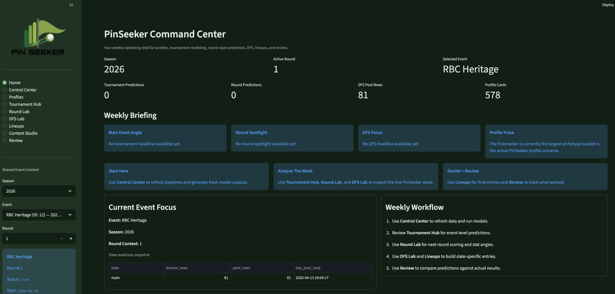 PinSeeker AnalyticsPersonal golf analytics operating system
×
BackNineIQ
Data Engineering
🏗 Architect + Product Owner + Builder
◆ Independent Project
⚠ Simulated Data
BackNineIQ —
Golf Club Visit Analytics
Private golf clubs had no way to connect a member’s golf visit to what they spent elsewhere on property that same day — three systems, zero shared keys, and no infrastructure to answer the most operationally important question.
Databricks
Python
SQL
Identity Resolution
Streamlit
Medallion Architecture
Product Design
Unity Catalog
GitHub →
The Problem
Three systems.
Zero shared keys.
Private clubs have a data fragmentation problem that is specific, common, and fixable. Membership data lives in a CRM. Golf activity is captured in a tee sheet platform. On-site spending sits in a POS system. None of these share a reliable common key.
Names are formatted inconsistently across systems, emails are sometimes missing from the tee sheet, and the POS has no concept of a member ID. The result is that operators, general managers, golf operations leads, and membership teams cannot connect golf play to spending behavior at the member level.
They run three separate reports and try to reconcile them manually. Key decisions about staffing, merchandising, and member engagement get made without the data that would make them better. The problem isn’t the data — it’s that no one has built the plumbing to connect it.
BackNineIQ is that plumbing. Built with synthetic but controlled data to simulate a realistic club environment, it answers one question: when a member comes to play golf, what else do they do and spend?
Gap 01 · Data Silos
CRM, tee sheet, and POS operate independently with no shared member identity key — no native way to join records across systems.
Gap 02 · Dirty Identity Fields
Names formatted differently across systems, missing emails on tee sheet rows, and the POS carries no concept of a member ID at all.
Gap 03 · No Analytical Layer
Even with clean sources, there was no reusable fact table linking golf visits to same-day spend — every query would require rebuilding that logic from scratch.
Gap 04 · No Stakeholder Surface
No reporting layer designed around the specific operational questions GMs, F&B directors, and membership staff actually ask — not a data problem, a product problem.
My Role
Built end to end
🏗
What I Owned
- Defined the product question and framed the analytics problem the pipeline needed to answer before writing any code
- Designed the full medallion architecture — Bronze ingestion, Silver identity resolution, Gold fact/dimension modeling, Platinum reporting layer
- Built the identity resolution logic — deterministic matching across CRM, tee sheet, and POS using email, phone, and normalized name matching
- Wrote all Python ETL pipelines and orchestrated them in Databricks with Unity Catalog for layer management
- Designed and built the Streamlit app — three pages mapped to three distinct stakeholder personas with intentional UX decisions
- Documented all tradeoffs and architectural decisions — built it to be explainable, not just functional
📋
Scope & Constraints
- All data is simulated — a controlled synthetic environment designed to behave like a real club, not a production client engagement
- Single-developer build — no engineering team, no QA, no dedicated infrastructure budget
- Streamlit chosen deliberately over Power BI — faster iteration on persona-specific views, Databricks-native deployment, full layout control
- Deterministic matching only — no probabilistic identity methods in v1; accepted lower initial match rate in exchange for zero false joins
- v1 scope — membership-type comparison page, spend-link audit page, and fuzzy matching are backlogged for v2
The Approach
From raw exports
to live app
Five stages. Each one cleanly separated so the pipeline is explainable, testable, and extensible.
01
Source Sim
Generated realistic messy source data — CRM export, tee sheet JSON, POS CSV — with controlled overlap and intentional dirty fields.
02
Bronze Ingest
Loaded raw files into Databricks Unity Catalog. Preserved source truth exactly — no business logic, no transformations at this layer.
03
Silver + Identity
Standardized all three sources. Built deterministic match logic to resolve a single backnine_global_id per resolved member.
04
Gold + Platinum
Built reusable fact/dimension models in Gold. Then Platinum app-ready summaries — keeping presentation logic out of the analytical layer.
05
App Deployment
Built a three-page Streamlit app on Databricks Apps, querying Gold and Platinum directly via SQL Connector with service principal auth.
The Stack
Tools & architecture
Every tool chosen for a specific reason — and a Lucid-style medallion flow diagram built from the architecture document.
🧱
Databricks
Pipeline orchestration, Unity Catalog, Apps deployment
🐍
Python
ETL pipelines, identity resolution, data simulation
🗄️
SQL
Schema design, Silver/Gold transformation queries
📊
Streamlit
Three-page stakeholder app on Databricks Apps
🗂️
Unity Catalog
Medallion layer governance and table management
Medallion Pipeline Architecture
Source → Bronze → Silver → Gold → Platinum → App
BackNineIQ v1
The Output

What was delivered
A live Databricks Streamlit app with three stakeholder views — each page answering exactly one operational question.
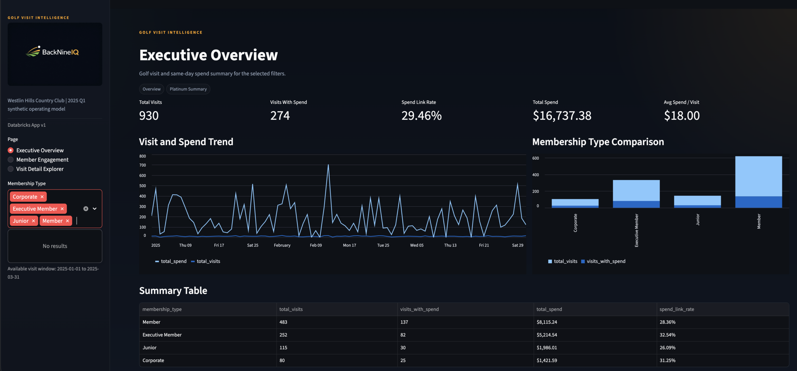
Page 1: Executive Overview — the General Manager view. KPI strip, visit and spend trend charts, membership-type comparison, and a summary table. Powered by platinum.rpt_member_visit_summary.
Streamlit App
3 Pages
Live on Databricks
Simulated Data
Results
The stat sheet
4+
Data Sources Unified
CRM, tee sheet, and POS joined under a single backnine_global_id — plus the identity bridge layer.
Pt.
Full Medallion Pipeline
Bronze → Silver → Gold → Platinum. Every layer documented, schema-defined, and purpose-separated.
3×
Stakeholder Personas
GM, F&B Director, Membership Manager — each page answers exactly one core operational question.
100%
Deterministic Identity
Zero probabilistic matching. Every resolved join has a confirmed shared key with documented fallback logic.
TPM Lens
Key decisions & tradeoffs
The choices that shaped the architecture — and what was knowingly accepted or given up.
| Decision | Rationale | Tradeoff |
|---|---|---|
| Deterministic identity only | A confirmed match is always more valuable than a probable one. Stakeholder trust in the data depends on confidence that joined records are real — not inferred. Probabilistic methods would require a confidence threshold that no one in a v1 product has calibrated yet. | Lower initial match rate — some members without consistent cross-system fields are excluded from analysis until source data quality improves at origin. |
| Identity resolved in Silver, not Gold | The backnine_global_id is solved once and reused everywhere. New source systems can integrate into the identity model without changing any Gold design. |
Clean separation of concerns — Silver owns identity, Gold owns business behavior. No logic leaks between layers. |
| Streamlit over Power BI | Databricks-native deployment, Python-first development, full layout control per persona, and no licensing constraints. Each page could be tuned independently without fighting a shared report canvas. | Lower executive familiarity — Power BI is the known tool in most club contexts. Streamlit requires a URL deployment step that embedded Power BI avoids. |
| Platinum layer for app-ready outputs | The core business question requires a pre-joined, pre-aggregated surface. Pushing that logic into the Streamlit app would couple presentation to transformation — making both harder to maintain and test. | Extra pipeline stage and Platinum refresh latency, accepted in exchange for faster app queries and cleaner Streamlit code. |
| Three separate app pages vs. one unified dashboard | Each stakeholder asks fundamentally different questions. A unified dashboard would require cognitive filtering that reduces adoption. One question per page is a product decision, not an engineering shortcut. | More maintenance surface — three views to update when schema changes. Accepted as the correct product tradeoff for usability and stakeholder adoption. |
Gallery
Screenshot gallery
Every app view, pipeline artifact, and data layer — click any screenshot to expand.
Executive Overview
Page 1 · GM persona · Visit revenue, trends, member type breakdown
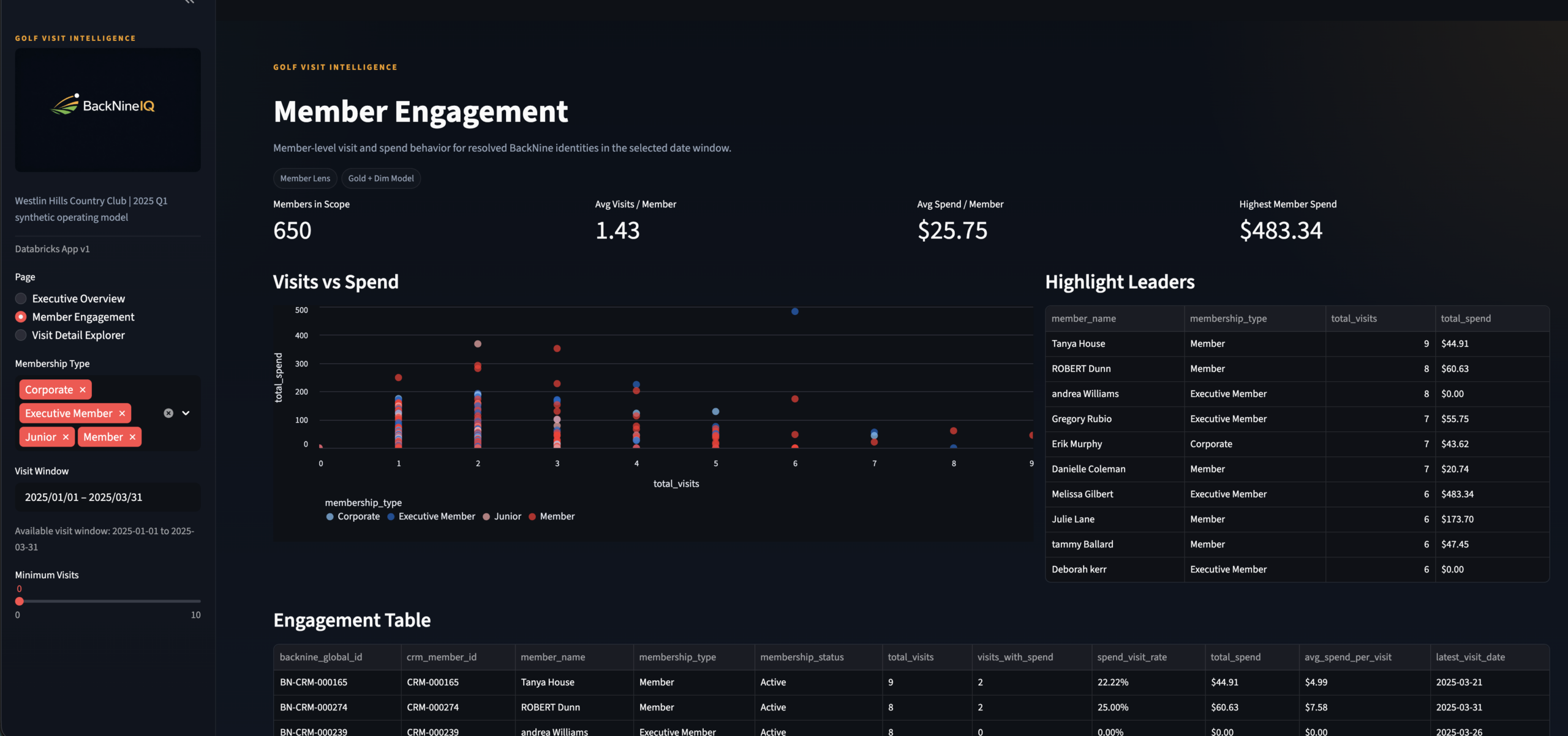
Member Engagement
Page 2 · Membership Manager persona · Scatter + engagement table
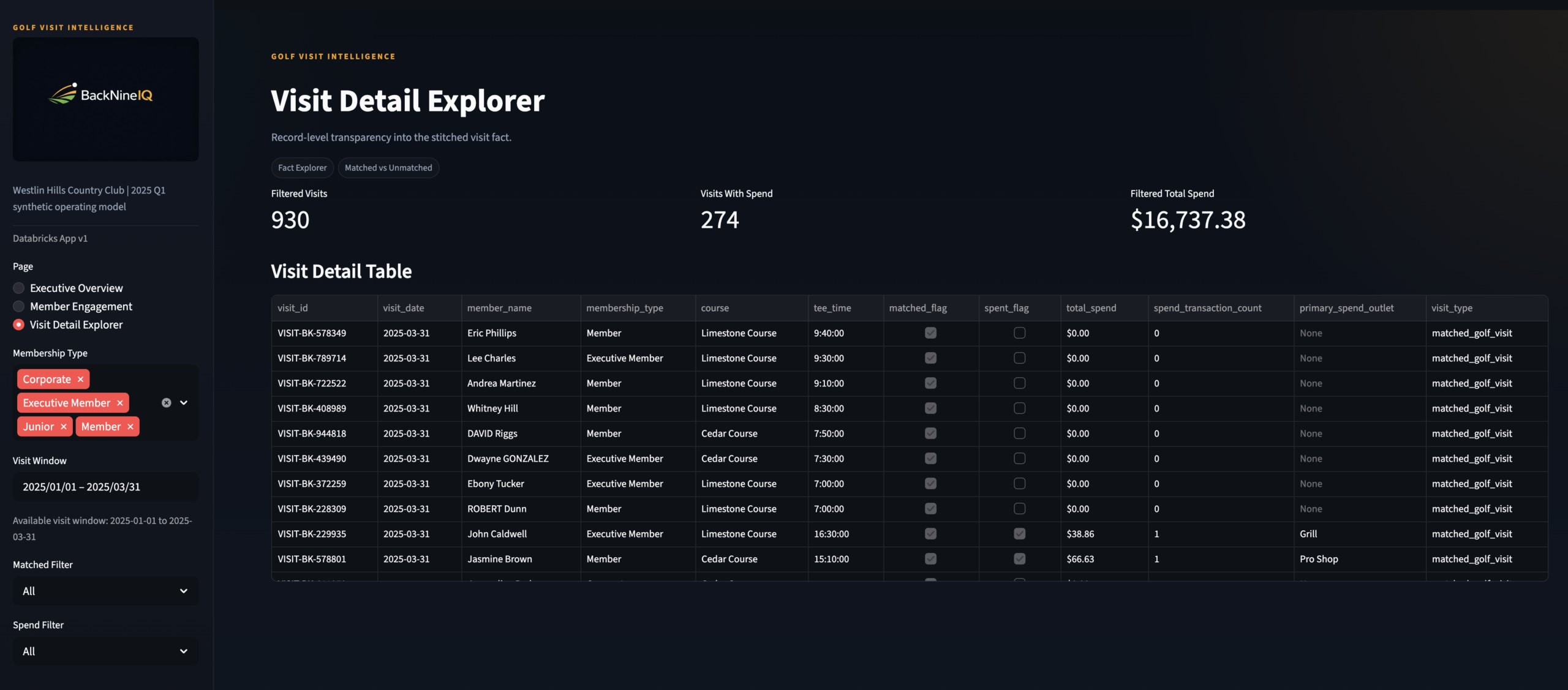
Visit Detail Explorer
Page 3 · F&B Director persona · Row-level visit drill-through

KPI Strip Close-Up
Executive Overview header · Total visits, revenue, avg spend per visit

Engagement Scatter Plot
Member Engagement · Visits vs spend · Segment by membership type
Engagement Table
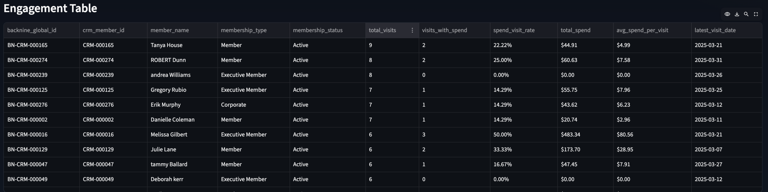
Member Engagement · Ranked member spend + visit frequency
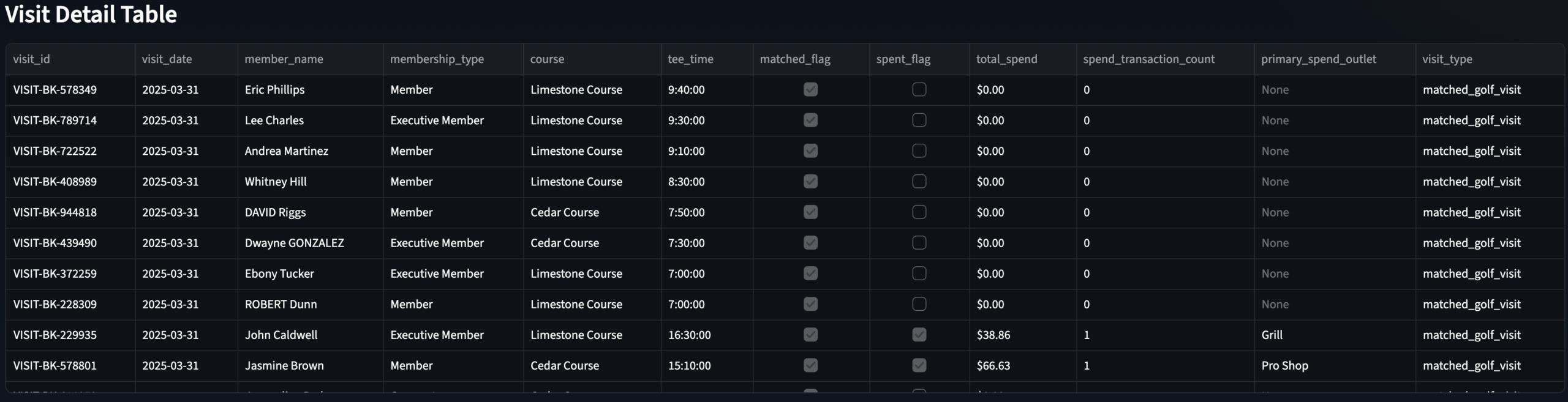
Visit Detail Table
Visit Detail Explorer · Row-level modeled visit data with spend filter
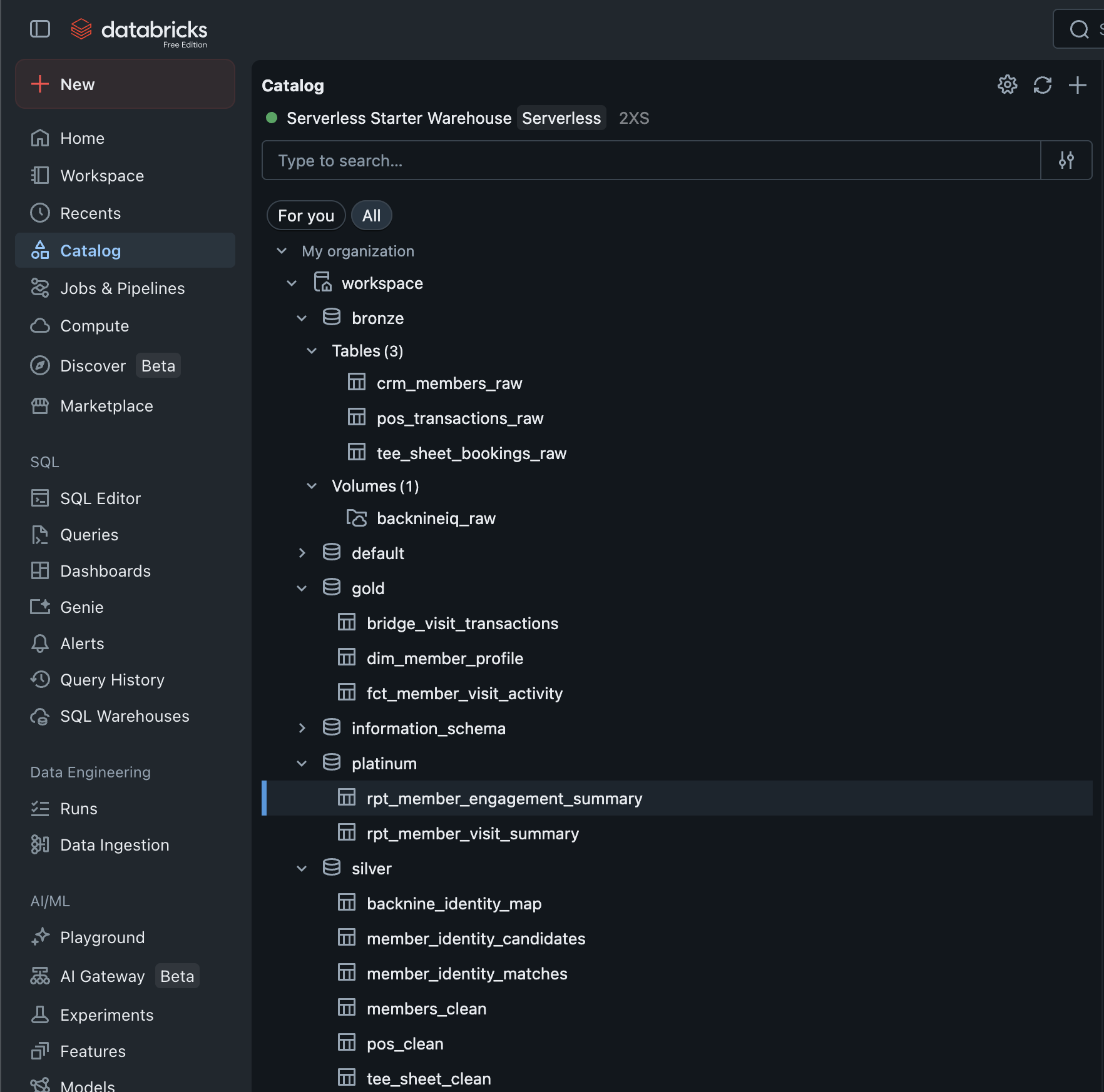
Databricks Unity Catalog
All four medallion layers — Bronze through Platinum — in Unity Catalog
×
GamePulse Data Warehouse & Analytics Stack
Data Engineering
🏗 Architect
◆ Independent
GamePulse —
Sports Data Warehouse
& Analytics Stack
A full-stack data engineering environment that models how modern sports organizations build enterprise-grade data infrastructure — end-to-end ETL pipeline using the Bronze → Silver → Gold medallion pattern in SQL Server, with T-SQL stored procedures automating each transformation layer and Python driving realistic data generation.
SQL ServerT-SQLPythonMedallion ArchitectureStored ProceduresETL PipelineDimensional ModelingSurrogate Keys
🔗 View on GitHub
← All Projects
The Problem
Raw data everywhere.
Trusted data nowhere.
Sports organizations generate data from dozens of sources — ticketing systems, CRM platforms, email tools, merchandise systems, and more. Each one produces raw, messy, inconsistently formatted records that can't be queried together without significant transformation work.
The typical result is a reporting environment built on ad hoc queries, fragile spreadsheet joins, and analysts spending 80% of their time cleaning data before they can ask a single business question. The data exists. The infrastructure to trust it doesn't.
GamePulse was built to demonstrate exactly what that infrastructure looks like — a three-layer medallion warehouse where every transformation is documented, every business key is managed, and the Gold layer delivers analytical datasets that power dashboards and models without any further cleaning required.
The goal wasn't just to build a warehouse. It was to build one that reflects how a real analytics team would structure a repeatable, scalable data foundation for a sports org — modular, extensible, and ready for Power BI or Tableau on day one.
Gap 01 · No Trusted LayerRaw source data from ticketing, CRM, and email tools can't be queried reliably without standardization. The Silver layer solves this with consistent naming, data types, and keys.
Gap 02 · No Analytical ModelEven clean data isn't analytics-ready until it's shaped into facts and dimensions. The Gold layer delivers the aggregated, business-keyed outputs that reporting tools actually consume.
Gap 03 · Manual ETLWithout stored procedures, every transformation run requires manual scripting. T-SQL stored procedures automate the Silver and Gold layer builds, making the pipeline repeatable and auditable.
Gap 04 · No Data LineageSurrogate key management and automated load timestamps create an auditable lineage from raw ingestion through to the final analytical layer — so you always know where a number came from.
My Role
Designed and built
every layer.
🏗What I Built
- Designed the full three-schema medallion architecture in SQL Server — Bronze, Silver, and Gold schemas each with a defined purpose, grain, and transformation contract
- Built all Bronze layer ingestion tables — raw data landing zones accepting CSV, API, and Excel inputs with minimal transformation and full source fidelity
- Built all Silver layer transformation logic — data cleansing, standardization, consistent naming conventions, and surrogate key generation via T-SQL stored procedures
- Built the Gold layer analytical model — fact tables and dimension views designed for direct consumption by Power BI, Tableau, or ad hoc SQL analytics
- Wrote all T-SQL stored procedures for Silver and Gold automation — each layer runs as a controlled, repeatable procedure with consistent load timestamps and error-safe design
- Generated all source data with Python — faker-based realistic datasets covering customer profiles, ticket orders, and campaign events with intentional imperfections and variability
🔬Design Philosophy
- Industry-standard medallion pattern — Bronze, Silver, and Gold mirror the architecture used in modern enterprise data platforms including Databricks, Azure Synapse, and Snowflake
- Schema-driven, not script-driven — each transformation layer is defined by its schema contract, not by one-off query logic that breaks on re-run
- Extensible by design — the warehouse can absorb additional sources (team stats, financial data, marketing performance) by adding Bronze tables and corresponding Silver/Gold procedures without touching existing logic
- Reporting-ready Gold layer — Gold outputs are structured specifically for BI tool consumption: pre-aggregated, properly keyed, and free of transformation debt
- Available on GitHub — full DDL, stored procedures, and example analysis queries published for review
The Approach
Ingestion to insight,
one layer at a time
Five stages — each one building on the last, each one independent enough to test and validate before the next begins.
01Schema DesignDesigned the three-schema SQL Server architecture — Bronze, Silver, Gold — with DDL defining tables, keys, and load metadata fields.
02Data GenerationBuilt Python scripts using faker and pandas to generate realistic, imperfect source datasets — customers, ticket orders, campaign events with natural variability.
03Bronze IngestionLoaded raw source data into Bronze tables as-is. No transformation. Full source fidelity preserved for auditability and re-processing.
04Silver TransformT-SQL stored procedures run Bronze → Silver: trim, capitalize, standardize naming, assign surrogate keys, apply consistent data types.
05Gold ModelingGold stored procedures build fact tables and dimension views from Silver — pre-aggregated, BI-ready outputs for reporting and analytical consumption.
The Stack
Tools & architecture
Three tools with clearly separated responsibilities — and a full diagram of the medallion schema showing every table across all three layers.
🕶
SQL Server (SSMS)
Core data warehouse host — all three schemas, DDL, and stored procedure execution environment
📑
T-SQL Stored Procs
Silver and Gold layer automation — repeatable, auditable transformation pipelines with load timestamps
🐍
Python
Faker-based realistic dataset generation — customers, ticket orders, campaign events with natural variability
GamePulse Medallion ArchitectureSQL Server · Bronze → Silver → Gold · T-SQL Stored Procedures
Full DDL on GitHub
Architecture Breakdown
Three layers.
One clean data lifecycle.
Each layer has a strict contract — what it accepts, what it does, and what it produces. No layer does another layer's job.
| Layer | Purpose | Key Tables | Automation |
|---|---|---|---|
| Bronze | Raw ingestion — data lands exactly as received from source systems. No transformation, no business logic. Source fidelity preserved for re-processing and auditability. | bronze.sm_customerbronze.trs_ticket_ordersbronze.email_campaigns |
Python loader script (pyodbc + sqlalchemy) |
| Silver | Cleansed and conformed — trimmed, capitalized, standardized naming and data types. Surrogate keys generated. Each table maps one-to-one with its Bronze source but is trusted for analytical use. | silver.sm_customersilver.trs_ticket_orderssilver.campaign_events |
T-SQL stored procusp_LoadSilver |
| Gold | Aggregated and analytical — fact tables and dimension views shaped specifically for BI consumption. Pre-joined, pre-aggregated, and free of transformation debt. Power BI or Tableau connects here directly. | gold.fct_ticketinggold.dim_customersgold.vw_email_performance |
T-SQL stored procusp_LoadGold |
Gold Layer Outputs
What the Gold layer enables
Every Gold output is pre-built for a specific analytical question. No transformation required at query time.
🎫
Customer Segmentation & Retention
Cohort analysis by acquisition channel, purchase frequency, and LTV tier. Renewal rate trends and churn risk signals from vw_customer_retention.
🎫
Ticketing & Revenue Optimization
Aggregated revenue by segment, channel, date, and event type from fct_ticketing. Directly feeds Power BI KPI dashboards.
📧
Email Campaign Performance
Open rate, click rate, and conversion analysis by campaign and segment from vw_email_performance. Highlights underperforming sends and engagement trends.
👥
Customer Dimension
Business-keyed customer dimension from dim_customers with surrogate keys, segment labels, and LTV signals — the shared key that connects all fact tables.
Scale
The stat sheet
3 layersMedallion ArchitectureBronze, Silver, Gold — each with a defined purpose, schema contract, and independent test path.
2 procsT-SQL Automationusp_LoadSilver and usp_LoadGold automate the full transformation pipeline — repeatable, auditable, timestamp-tracked.
4+ tablesGold Analytical LayerFact tables and dimension views purpose-built for BI consumption — no further cleaning or joining required at query time.
🔗Open on GitHubFull DDL, stored procedures, and example analysis queries available for review at the Clutchlytics/gamepulse repository.
Architect's Lens
Key decisions & tradeoffs
The design choices that shaped the architecture — and the reasoning behind each one.
| Decision | Rationale | Tradeoff |
|---|---|---|
| Bronze preserves raw data exactly | The Bronze layer stores data exactly as received — no trimming, no type casting, no business logic. This is a deliberate principle: if a downstream transformation turns out to be wrong, you need the ability to re-process from raw without going back to the source system. Bronze is the source of truth, not a staging area. | Duplicate storage — keeping both raw and cleansed versions of the same data costs storage. Accepted as the right tradeoff because re-ingestion from external sources is more expensive than disk space in any real org. |
| T-SQL stored procedures over ad hoc scripts | Each transformation layer is automated through a named stored procedure rather than a one-off query file. This makes the pipeline repeatable without manual intervention, auditable through execution history, and testable in isolation. It mirrors how production ETL automation actually works in SQL Server environments. | Production-grade pattern — stored procedures are the SQL Server equivalent of dbt models or Databricks notebooks. The same pattern scales directly to enterprise environments without rearchitecting. |
| Surrogate keys in Silver, not Bronze | Business keys (surrogate keys) are generated in Silver because that's where identity is first resolved. Bronze carries whatever natural keys came from the source system, which may be inconsistent or missing. Silver is where the warehouse takes ownership of a unique, stable identifier for each business entity. | Clean identity lineage — every Gold fact table joins to the same surrogate key from Silver, making cross-table analysis consistent and preventing the key collisions that break reports in un-keyed warehouses. |
| Gold as views AND fact tables | The Gold layer uses both materialized fact tables (for aggregated metrics that benefit from pre-computation) and SQL views (for analytical summaries that should reflect Silver updates in real-time). The choice between them depends on query frequency and update cadence — documented in the schema DDL. | Two patterns to maintain — mixing tables and views in Gold adds a small maintenance surface. The alternative (all views) would be slower to query; all tables would require manual refresh on every Silver load. |
Explore the Full Repository
Schema DDL · Stored procedures · Example analysis queries · Clutchlytics/gamepulse
🔗 View on GitHub
TicketPush: Marketing Data Science & Attribution
Marketing Analytics
🔬 Analyst + 🏗 Architect
◆ Independent Project
⚠ Simulated Data
TicketPush —
End-to-End
Marketing Analytics
Most marketing teams run attribution, funnel, LTV, and promo ROI as four separate reports that never talk to each other — TicketPush builds the schema, data, and dashboard to answer all four from a single source of truth.
MySQL
Python
Power BI
Marketing Attribution
Customer Journey
Promo Code ROI
Funnel Analytics
LTV Modeling
The Problem
Marketing data that
never connects.
Mobile-first ticketing platforms generate data across every touchpoint — ad impressions, session behavior, promo code redemptions, purchases, and post-sale activity. Each system captures a piece of the customer story. None of them complete it.
Marketing teams end up with attribution reports that don’t account for promo impact, funnel reports disconnected from LTV, and campaign ROI calculations that can’t be compared channel-to-channel because the underlying data was never modeled relationally.
The result is that decisions about where to spend the next marketing dollar get made with incomplete signal — often optimizing for volume metrics when the actual margin story looks completely different.
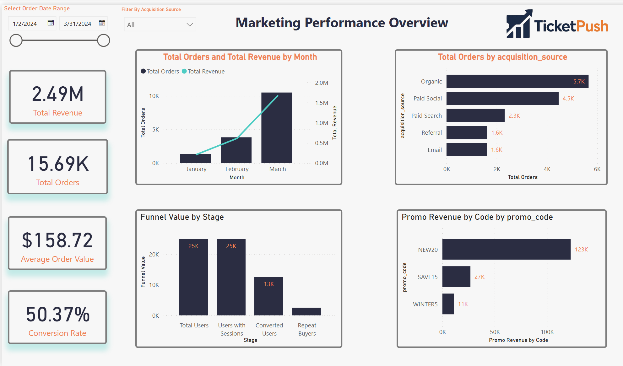
TicketPush simulates that environment end to end — schema designed from scratch, realistic data generated via Python, and a four-page Power BI dashboard built to answer the specific questions a growth or revenue team actually asks.
Gap 01 · Disconnected Attribution
First-touch and last-touch attribution lived in separate tools with no way to compare them against the same campaign spend or promo code usage.
Gap 02 · Funnel Without Context
Session-to-conversion funnel metrics existed but weren’t tied to channel, campaign, or customer tier — making them descriptive but not diagnostic.
Gap 03 · Promo Code Blindspot
Promo codes drove revenue but with no relational model, there was no way to calculate their true margin impact or compare them to non-promotional acquisition cost.
Gap 04 · No LTV Architecture
Customer lifetime value and repeat purchase risk lived in spreadsheets — no model to feed into campaign targeting or cohort comparison.
My Role
Schema to dashboard
🏗
What I Built
- Engineered the relational MySQL schema from scratch — eight tables, fully normalized, with realistic foreign key relationships across users, sessions, orders, campaigns, and promo codes
- Simulated all source data with Python — realistic user behavior, multi-channel campaign exposure, promo redemption patterns, and purchase timing distributions
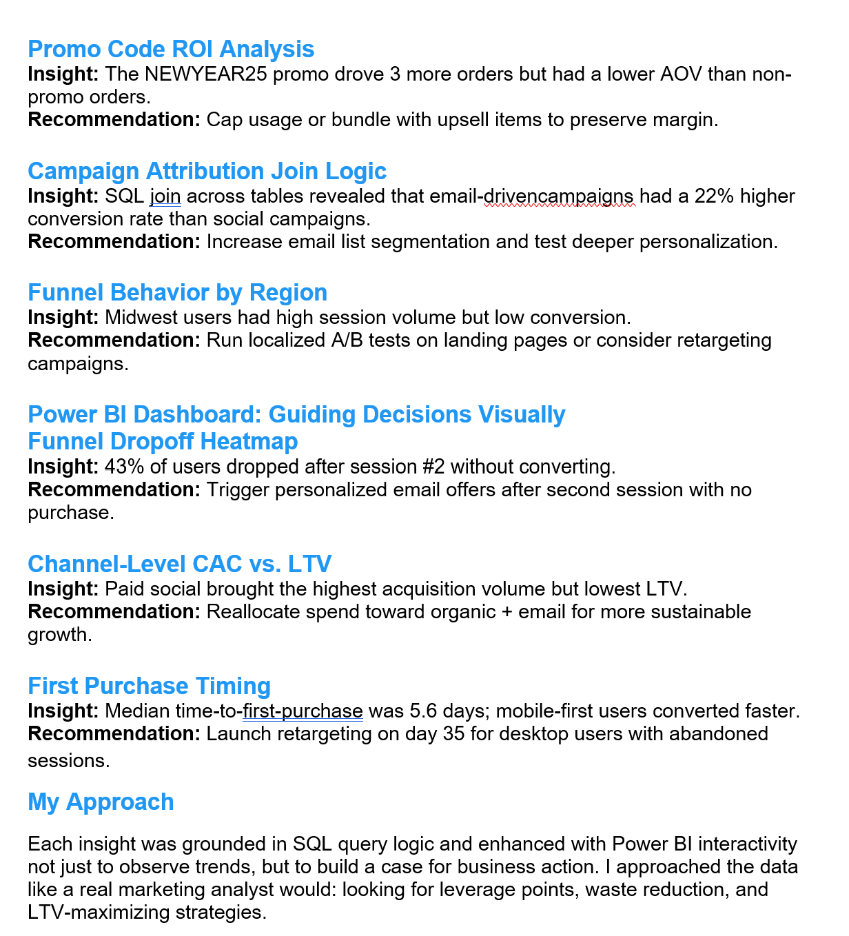
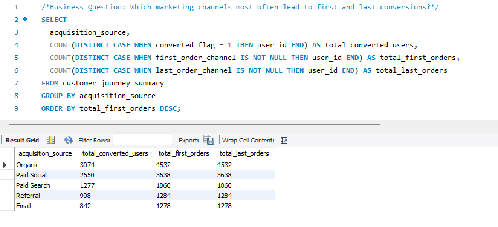
- Built both first-touch and last-touch attribution models — implemented as SQL logic and surfaced comparably in the same dashboard view
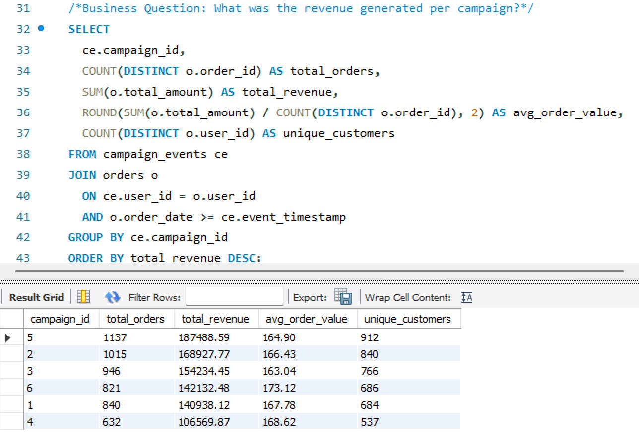
- Created the Customer Journey Summary table — a consolidation layer capturing each user’s full lifecycle: acquisition path, funnel stage, time-to-purchase, and repeat risk score
- Designed the four-page Power BI dashboard — each page answering a distinct analytical question with shared filters and consistent KPI definitions
📋
Scope & Constraints
- All data is simulated — designed to behave like a real mobile ticketing platform; not a client engagement or production dataset
- Single-developer build — schema design, data engineering, attribution logic, and visualization all by the same person
- Power BI chosen deliberately — industry-standard for marketing analytics reporting; demonstrates the ability to take SQL output and translate it into executive-ready dashboards
- MySQL over a cloud warehouse — intentional for the simulation context; same schema logic transfers directly to BigQuery or Redshift
- Repeat risk model is behavioral — based on purchase recency and frequency patterns, not a trained ML classifier; noted as a v2 upgrade path
The Approach
From blank schema
to actionable insight
Five stages — each one producing an artifact that the next stage depends on.
01
Schema Design
Designed an 8-table relational MySQL schema covering the full customer lifecycle — users to sessions to orders to campaigns.
02
Data Simulation
Generated realistic mock data with Python — behavioral distributions, multi-channel exposure, promo redemption rates, and purchase timing.
03
Attribution Logic
Built first-touch and last-touch attribution in SQL. Linked campaign spend to revenue and calculated channel-level ROAS.
04
Journey Summary
Consolidated each user’s lifecycle into a single Customer Journey Summary table — funnel stage, LTV, repeat risk, and acquisition path.
05
Dashboard Build
Built a four-page Power BI dashboard with consistent KPI definitions, shared filters, and one analytical question per page.
The Stack
Tools & schema
Four tools, eight tables — and a relational schema diagram showing how the data model connects.
🗄️
MySQL
Relational schema design, attribution logic, journey summary queries
🐍
Python
Full dataset simulation — user behavior, campaigns, sessions, purchases
📊
Power BI
4-page executive dashboard — attribution, funnel, LTV, advanced analytics
📑
Excel
Campaign cost inputs, promo code validation, QA reference tables
Relational Database Schema
MySQL · 8 Tables · Full customer lifecycle
TicketPush v1
The Output
Four pages. One source of truth.
A Power BI dashboard built around four distinct analytical questions — each page answers one and connects to the others through shared filters and consistent KPI definitions.
Page 01
Marketing Performance
Revenue, Orders, CAC, ROAS by channel
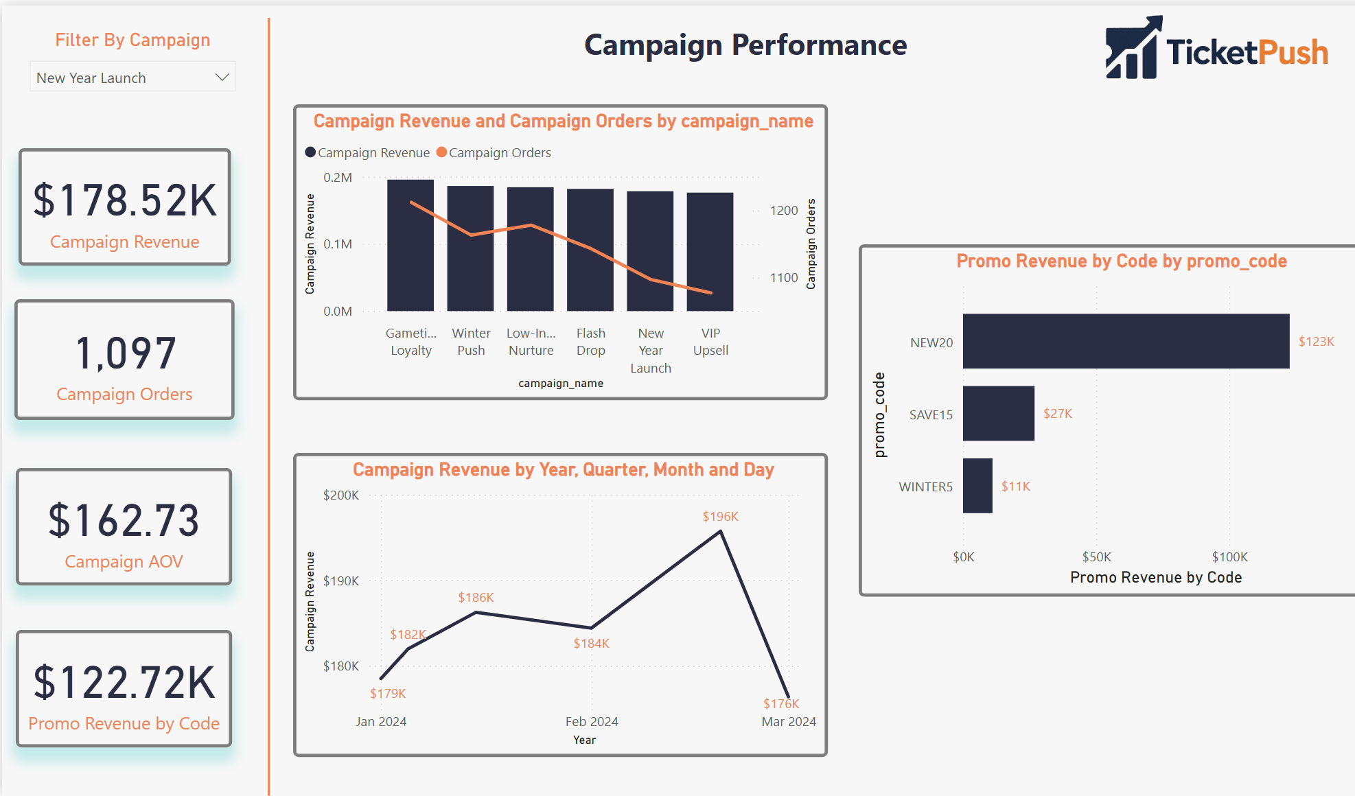
Page 02
Attribution & ROI
First-touch vs last-touch · Promo code impact
Screenshot Not Available
Page 03
Customer Funnel & LTV
Session → conversion · LTV segmentation
Screenshot Not Available
Page 04
Advanced Analytics
Journey summary · Repeat risk · Cohorts
Pages 03 and 04 screenshots pending upload — placeholders shown above
Results
The stat sheet
8 tables
Relational Schema
Fully normalized MySQL schema covering the complete customer lifecycle — users, sessions, orders, campaigns, and promo codes.
4 pages
Power BI Dashboard
Marketing Performance, Attribution & ROI, Customer Funnel & LTV, and Advanced Analytics — one question per page.
2×
Attribution Models
First-touch and last-touch attribution built in SQL and surfaced comparably in the same dashboard — against the same campaign spend.
1 CJS
Customer Journey Summary
Single consolidated table per user — acquisition path, funnel stage, LTV, time-to-purchase, and repeat risk score in one row.
Analyst Lens
Key decisions & tradeoffs
The modeling choices that shaped the output — and what each one cost.
| Decision | Rationale | Tradeoff |
|---|---|---|
| Both attribution models, same view | First-touch and last-touch tell different stories about the same campaign spend. Showing them side-by-side in the same dashboard lets analysts see where they diverge — and where that divergence changes the channel investment decision. | More complex DAX — maintaining two attribution paths in the same Power BI model required careful measure isolation to prevent filter context bleed between models. |
| Customer Journey Summary as a pre-built table | Consolidating lifecycle metrics into a single per-user table makes every downstream query simpler. Without it, the LTV and funnel calculations would require multi-join logic on every dashboard page — adding latency and maintenance risk. | Refresh dependency — the summary table must be rebuilt whenever source data changes. Acceptable for a simulation; in production this becomes a scheduled pipeline job. |
| MySQL over a cloud warehouse | The relational schema logic is identical whether run in MySQL, BigQuery, or Redshift. MySQL was chosen for local development speed and to demonstrate that the analytical design is tool-agnostic — the queries transfer directly. | Fully portable — every SQL file in this project runs on BigQuery or Redshift with minimal syntax changes, making it a genuine production blueprint. |
| Behavioral repeat risk, not ML classifier | A rule-based repeat risk score (recency × frequency) is transparent and explainable. A trained classifier would produce better predictions but would require ground truth labels that don’t exist in a simulated dataset. | Lower predictive accuracy — acknowledged as a v2 upgrade path once the dataset has real behavioral history to train against. |
| Python simulation over static seed data | Generating data programmatically means the dataset can be scaled, varied, or re-seeded to test edge cases. It also demonstrates the ability to model realistic behavioral distributions — not just assign random values. | Reproducible and scalable — the simulation can generate 1,000 users or 100,000 users with a single parameter change, making it a proper load-testing environment. |
Gallery
Screenshot gallery
Dashboard views, SQL logic, and Python simulation — click any screenshot to expand.
Marketing Performance
Page 1 · Revenue, Orders, CAC, ROAS by channel
Attribution & ROI
Page 2 · First-touch vs last-touch · Promo code impact
Insights Summary
Key analytical findings across attribution and funnel
SQL Attribution Logic
First-touch and last-touch attribution queries
SQL Customer Journey
Customer Journey Summary build query
Schema CREATE Statements
MySQL table definitions — relational schema build
Python Data Simulation
Behavioral data generation — users, sessions, orders, campaigns
Repeat Risk Prediction
Behavioral purchase model — recency × frequency scoring
×
WEHF Analytics Case Study
Business Analytics · Sports Data
🔬 Analyst + 🏗 Architect
◆ Independent
🪟 Simulated Data
WEHF —
Full-Funnel Sports Analytics
Case Study
A comprehensive mock analytics ecosystem built from scratch for a fictional professional women's hockey league — SQL warehouse, 7-page Power BI dashboard, DAX modeling, and six complete analyses spanning ticketing, fan segmentation, email performance, web behavior, merchandise, and market expansion.
🪟 Mock Case Study · Simulated Data
The Women's Elite Hockey Federation (WEHF) is a fictional league created entirely for this portfolio project. All data was simulated with realistic fan behavior, geographic distribution, and market variability to mirror what you'd encounter in a real startup sports property. This project demonstrates how I would approach building an analytics infrastructure and insight layer for a new sports organization — not a client engagement.
SQLPower BIDAXFan SegmentationTicket FunnelEmail AnalyticsWeb BehaviorMarket ExpansionLTV Modeling
The Problem
Building analytics for a league
that doesn't exist yet.
A startup professional sports league faces an analytics challenge that's different from an established property. There's no historical baseline, no inherited infrastructure, and no analytics team to hand off to. Everything has to be built from raw data with no prior context.
The questions a startup league actually asks are harder than they look: Where are our fans? Which markets are worth activating? Are we saturating our email list before we've earned the engagement? Which ticket buyers will come back, and which were one-game curiosity?
This project was built to answer all of those questions simultaneously — not as a series of disconnected reports, but as a unified analytics ecosystem where every insight layer feeds the next one. Fan segmentation informs email strategy. Email performance informs digital investment. Digital behavior informs market expansion priorities.
The goal wasn't to build dashboards. It was to demonstrate how I think when standing up analytics for a new organization — what to build first, what questions matter most, and how to connect technical outputs to business decisions.
Gap 01 · No Analytics FoundationA startup league has no warehouse, no reporting layer, and no shared definitions. The first job is building the infrastructure that makes any analysis possible — before asking a single business question.
Gap 02 · Disconnected Data SourcesTicketing, email, web, and merchandise data don't naturally connect. Without relational modeling, every analysis requires manual reconciliation — making real-time decision support impossible.
Gap 03 · Undifferentiated Fan ViewTreating all fans the same wastes budget and misses intent. The highest-value insight from a startup league is identifying which fan segments are worth investing in before resources are allocated.
Gap 04 · No Expansion IntelligenceKnowing where to grow is harder than knowing current performance. Using digital signals and early fan behavior to identify low-cost market expansion opportunities is the kind of forward-looking work that shapes league strategy.
My Role
Analyst, architect,
and product owner.
🏗What I Built
- Designed and built the SQL data warehouse — relational tables for fans, ticketing, email campaigns, web traffic, and merchandise with realistic geographic distribution across simulated league markets
- Built a 7-page Power BI dashboard suite — Executive Summary, Ticketing Funnel, Fan Segmentation, Email Performance, Web Behavior, Merchandise, and Market Expansion
- Created all DAX measures — lifetime value metrics, renewal rate analysis, email campaign scoring, and web session flow logic using custom measures built from scratch
- Simulated realistic fan data — behavioral distributions, purchase patterns, geographic concentration, and data imperfections that mirror real startup league environments
- Derived all six analytical insights — ticket funnel drop-offs, email saturation flags, web bounce patterns, fan cohorts, merchandise underperformance, and market expansion signals
🔬How I Approached It
- Treated it like a real engagement — designed the warehouse around the business questions first, then built the data structures to support them rather than building data and asking questions later
- Leaned into realistic imperfection — the simulated data includes the kinds of gaps, inconsistencies, and market variability you actually encounter in a startup sports org, not clean classroom data
- Each insight connects to a decision — every analysis was framed around what a department head (marketing, sales, digital, ops) would actually do differently based on the finding
- Cross-department coverage — intentionally designed to cover every major business function so the dashboard suite could serve as a complete analytics operating layer for a new organization
- Built for executive readability — the Executive Summary page is designed to answer the five questions a league GM asks on Monday morning without requiring any analytical background
The Approach
Infrastructure first,
then insight
Five stages — building the foundation before the analysis, then connecting every insight to a business decision.
01Schema DesignDesigned a relational SQL schema covering fans, ticketing, email, web, and merch — built around the business questions, not the other way around.
02Data SimulationGenerated realistic fan behavior with geographic distribution, purchase patterns, and intentional data imperfections that mirror a real startup environment.
03DAX ModelingBuilt LTV metrics, renewal rates, email scoring, and session flow logic using custom DAX measures designed to support cross-page drill-through.
04Dashboard BuildDesigned 7 Power BI pages — each answering one analytical question and connecting to the others through shared filters and consistent KPI definitions.
05Insights LayerTranslated every dashboard view into a decision recommendation — framed for the marketing, sales, digital, and ops stakeholders who would act on it.
The Stack
Tools & data model
Four tools and a relational schema diagram showing how the five source tables connect into the analytics layer.

📑DAXLTV metrics, renewal rates, email scoring, session flow logic — all custom measures
📈ExcelData validation, QA reference tables, market mapping inputs
WEHF Data Warehouse SchemaSQL · 5 Relational Tables · Fan-Keyed Architecture
Mock Dataset
The Analysis
Six questions.
Six decisions.
Every analysis was built around a specific business question — and framed around the decision it would drive, not just the finding it would surface.
🎫
Ticket Sales Funnel
Where does the drop-off happen?
Identified conversion drop-offs between ticket browsing and checkout. Modeled differences by weekday vs. weekend, game quality tier, and fan type — surfacing where targeted friction reduction would move the most volume.
📧
Email Performance
Are we emailing too much?
Analyzed open/click behavior, conversion rates, and send-frequency impacts. Flagged oversaturation issues where high-frequency sends were actively reducing conversion, and identified underperforming creative segments.
🌐
Web Behavior (Sankey)
Where does traffic go after it lands?
Mapped session flows across the site, flagged high-bounce pages and dead-end paths, and recommended specific mobile UX improvements based on device-segmented drop-off patterns.
👥
Fan Segmentation
Who are the fans worth investing in?
Built fan cohorts by market, engagement level, and purchase behavior. Identified key markets with strong digital signals and low activation costs — the most actionable output for a startup league with limited budget.
📸
Merchandise & Revenue
Why is merch underperforming in some markets?
Revealed merchandise underperformance outside core teams and flag markets. Suggested localized and performance-themed product ideas based on fan behavior and team affinity patterns in secondary markets.
📍
Market Expansion
Where should the league go next?
Used early fan digital signals in non-core cities to identify low-cost testing opportunities for league growth. Framed as a prioritized market scorecard, not just a map.
The Output
Seven pages.
One analytics layer.
Each dashboard page answers one analytical question and connects to the others through shared filters and consistent KPI definitions. Click any screenshot to expand.
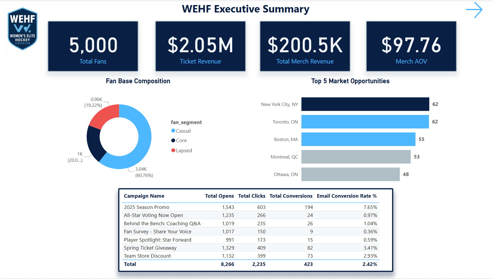
Page 1 — Executive Summary: The Monday morning view. Top-line KPIs, league health at a glance, and quick navigation to any department-level analysis. Designed for the GM who has 60 seconds before the weekly call.
Page 1 of 7Power BIMock Data
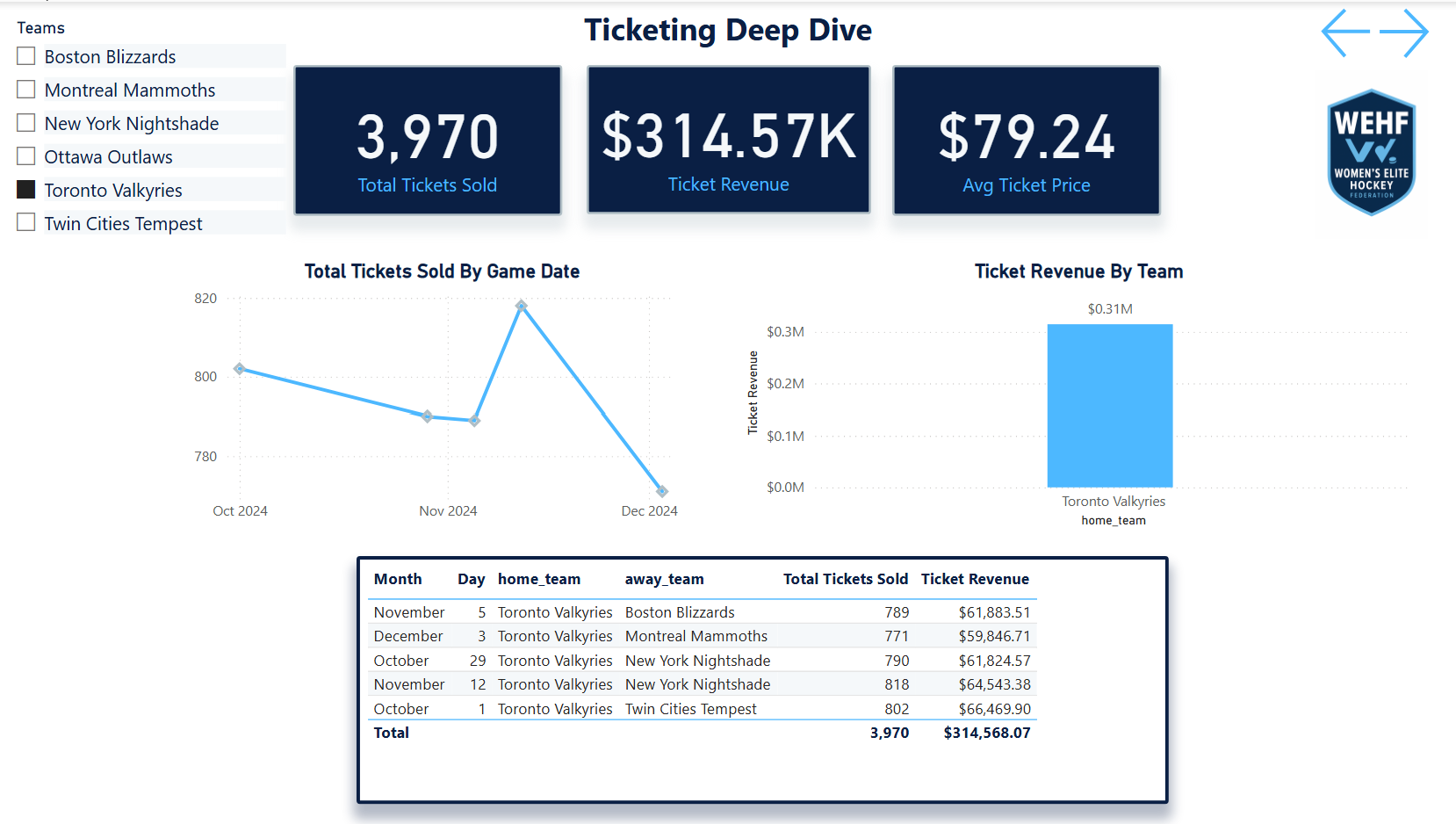
Ticketing FunnelPage 2 · Browse-to-purchase conversion · weekday vs weekend
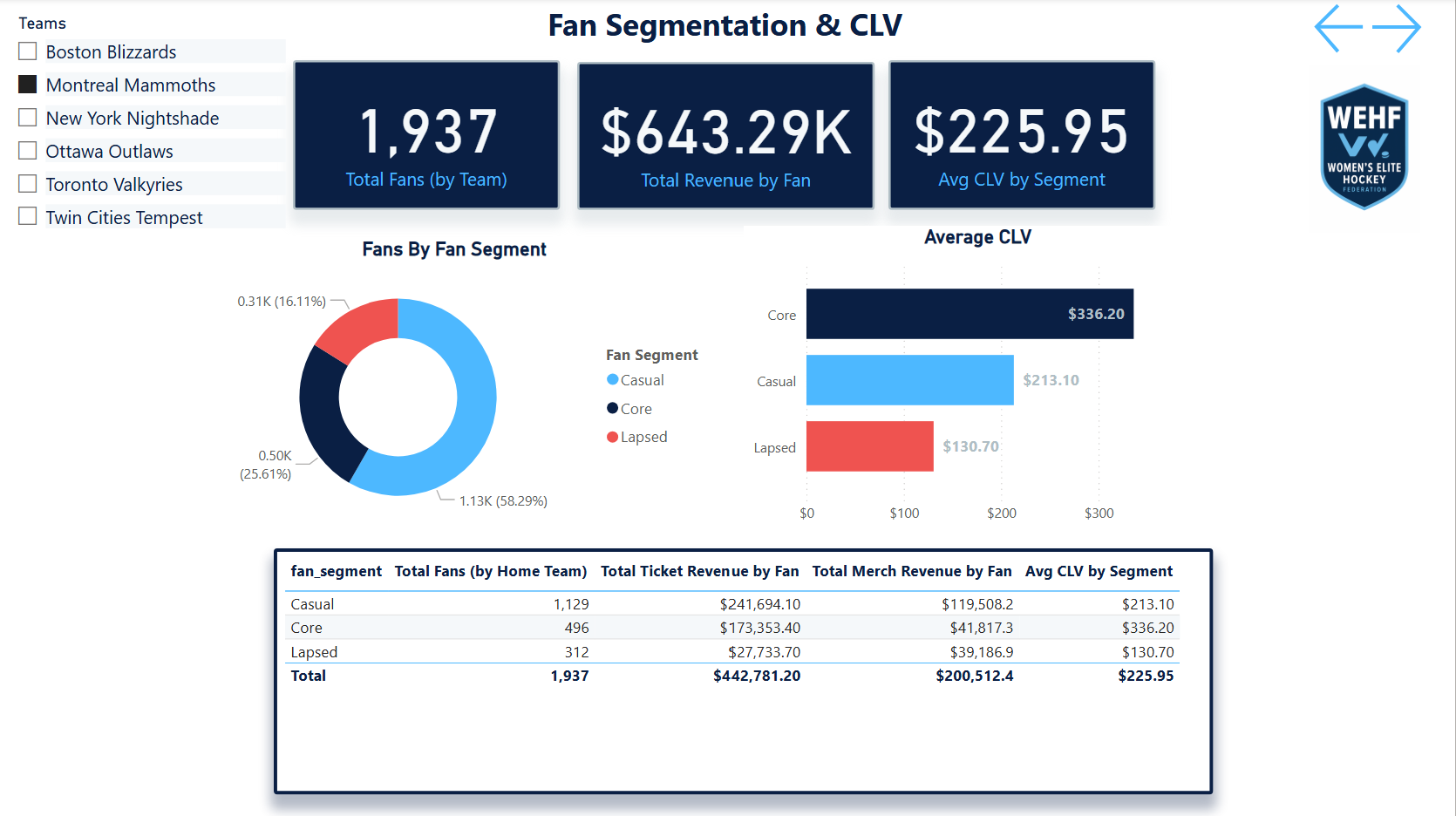
Fan SegmentationPage 3 · Market cohorts · engagement level · LTV tiers
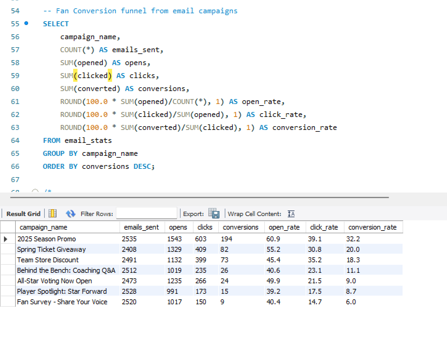
Email PerformancePage 4 · Open/click rates · saturation flags · conversion scoring
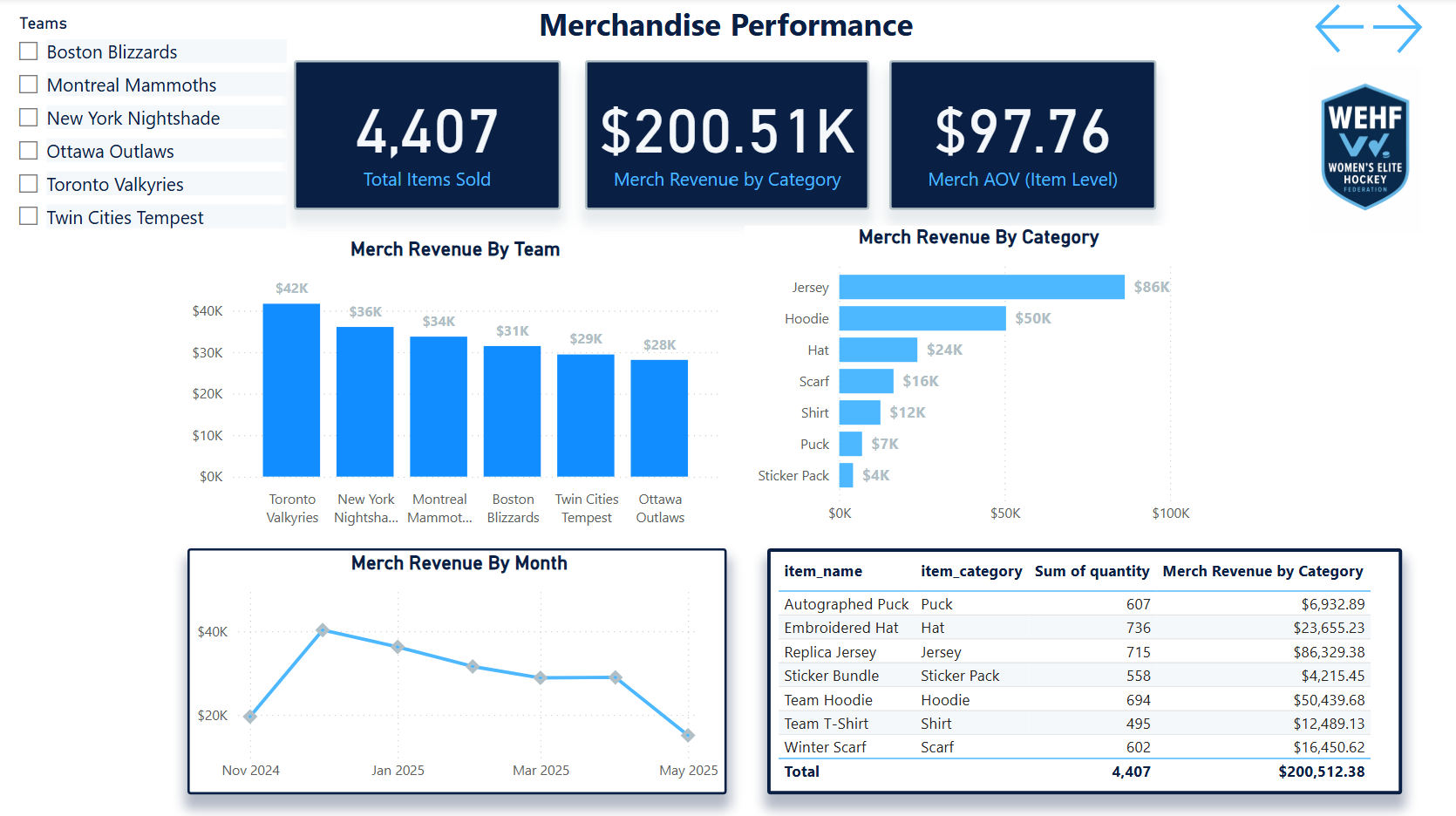
Merchandise & RevenuePage 5 · Product performance · market-level underperformance
Web Behavior
Sankey flow · Page 6
Web Behavior SankeyPage 6 · Session flows · bounce flags · mobile UX gaps
Market Expansion
Growth signals · Page 7
Market ExpansionPage 7 · Digital signals · low-cost expansion scorecard
SQL & Data Layer
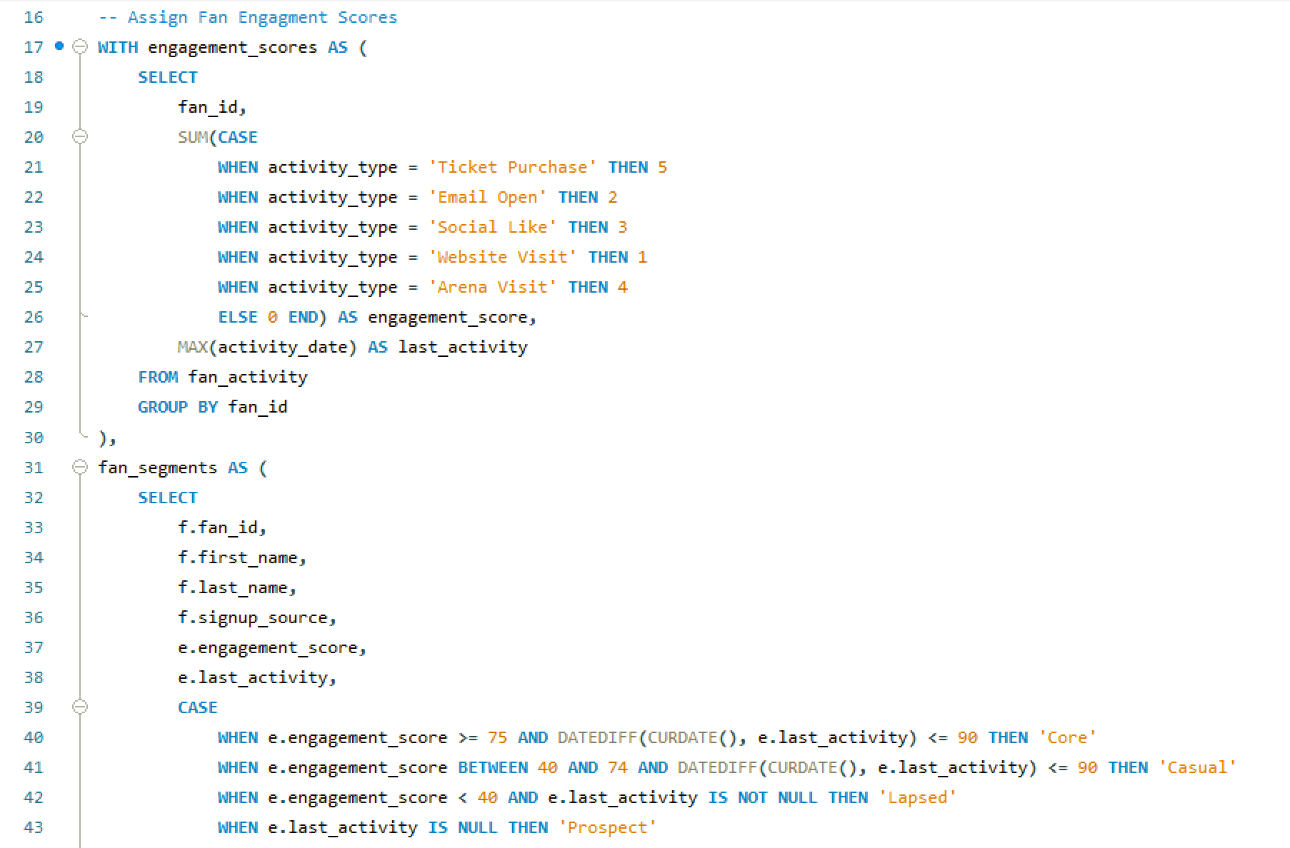
Fan Engagement ScriptSQL · fan scoring and engagement logic behind the segmentation model
Data SimulationSQL · fan table population with geographic distribution and behavioral seeding
Scale
The stat sheet
7 pagesPower BI DashboardExecutive Summary, Ticketing, Fan Segmentation, Email, Web, Merchandise, Market Expansion — one per business function.
5 tablesSQL WarehouseFans, ticketing, email campaigns, web sessions, merchandise — all fan-keyed and geographically distributed to simulate real league markets.
6 analysesFull-Funnel CoverageTicket funnel, email saturation, web behavior, fan segmentation, merchandise, and market expansion — each connected to a decision.
4 deptsStakeholder CoverageMarketing, sales, digital, and ops — each dashboard page was designed for a specific department's decision-making workflow.
Analyst Lens
Key decisions & tradeoffs
The choices that shaped how this case study was built — and why each one mattered more than it might seem.
| Decision | Rationale | Tradeoff |
|---|---|---|
| Fan-keyed relational schema | Anchoring every table to a shared fan_id was the foundational decision that made every cross-source analysis possible. A ticket buyer who also opens emails and buys merchandise is one person — the warehouse had to know that. Without it, fan segmentation and LTV modeling would require manual joins on every analysis. | Web sessions nullable — anonymous web traffic can't always be attributed to a known fan. Rather than forcing attribution, web_sessions carries a nullable fan_id, which kept the data honest at the cost of some cross-source completeness. |
| Realistic imperfect data | The simulated dataset was intentionally built with gaps, inconsistencies, and market variability. Startup sports orgs don't have clean data. A portfolio project that assumes perfect data doesn't demonstrate how to operate in reality — it demonstrates how to operate in a classroom. | More credible output — the analyses surface data quality observations alongside business insights, which is closer to what a real analytics engagement actually produces. |
| One page per business question | A 7-page dashboard that answers seven distinct questions is more useful than a single dashboard that tries to answer all of them. Each page was scoped to one stakeholder and one decision — the marketing director doesn't need the ticketing funnel on the same screen as the merchandise breakdown. | Cross-page navigation required — connecting insights across pages requires the user to move between views. For a more integrated experience, a unified cross-filter layer would be a v2 enhancement. |
| Decision framing over data presentation | Every analysis concluded with a specific recommended action, not just a finding. The email saturation insight doesn't end at “send frequency is too high for this cohort” — it ends at “reduce cadence for engaged non-converters by 40% and reallocate send budget to lapsed purchasers.” That's the difference between an analytics report and analytics leadership. | Demonstrates PM thinking — framing outputs as decisions rather than findings is the lens that separates an analyst who reports on data from one who drives business outcomes with it. |
×
Email Engagement Scoring System
📧 Email Engagement Scoring System
Marketing Analytics | Modeled with Anonymized Data
In this project, I recreated a simplified, anonymized version of an Email Engagement Scoring Model I originally developed in a professional marketing role. The goal? To better understand how users interact with email campaigns and to translate those behaviors into actionable insights for smarter targeting.
🔍 What I Built
I created a scoring system that evaluates user interactions based on email open and click behavior, then categorizes each user into engagement tiers from 0 to 5.
Here’s how it works:
- Open Rate = Emails Opened ÷ Emails Received
- Click Rate = Emails Clicked ÷ Emails Received
- Weighted Action Rate = (Open Rate + 3×Click Rate) ÷ 2
(Because clicks signal stronger intent, they’re weighted 3x more.) - Score 0 = Received emails but never opened any
- Scores 1–5 = Assigned based on fixed percentiles of normalized scores, where Score 5 reflects top-tier engagement
💡 Why This Matters
This scoring model helps teams go beyond surface-level email metrics and actually segment users based on how they behave. That means better targeting, smarter campaign decisions, and ultimately stronger results.
Whether you’re in marketing, sales, or customer success, having a simple, data-backed way to measure engagement can unlock a lot of value.
🧪 This Demo Includes
- A dummy dataset modeled after real-world behavior
- Visual breakdowns
Examples of how this could be applied in campaign targeting or lead scoring
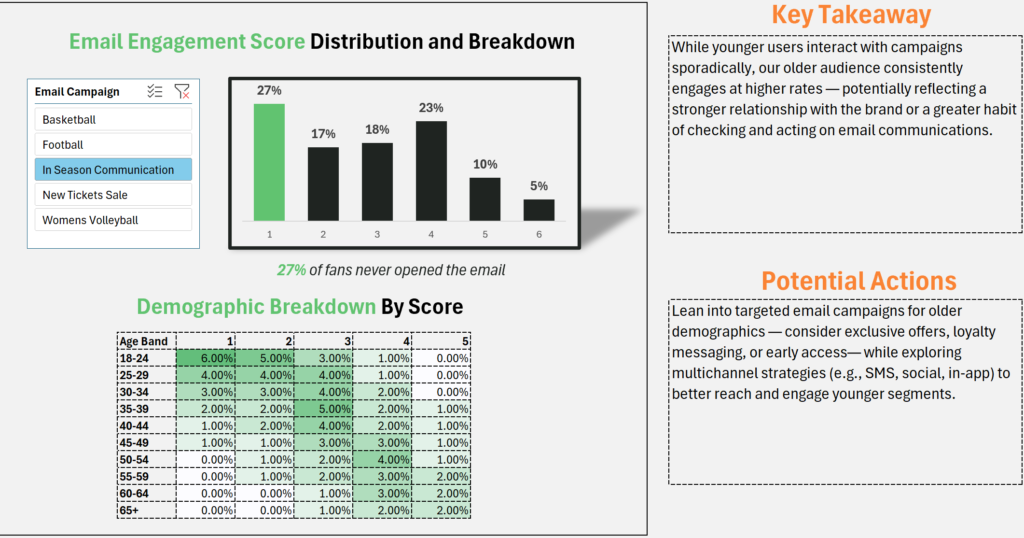
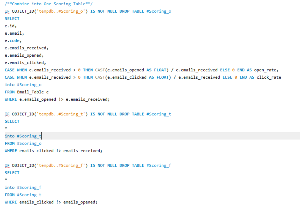
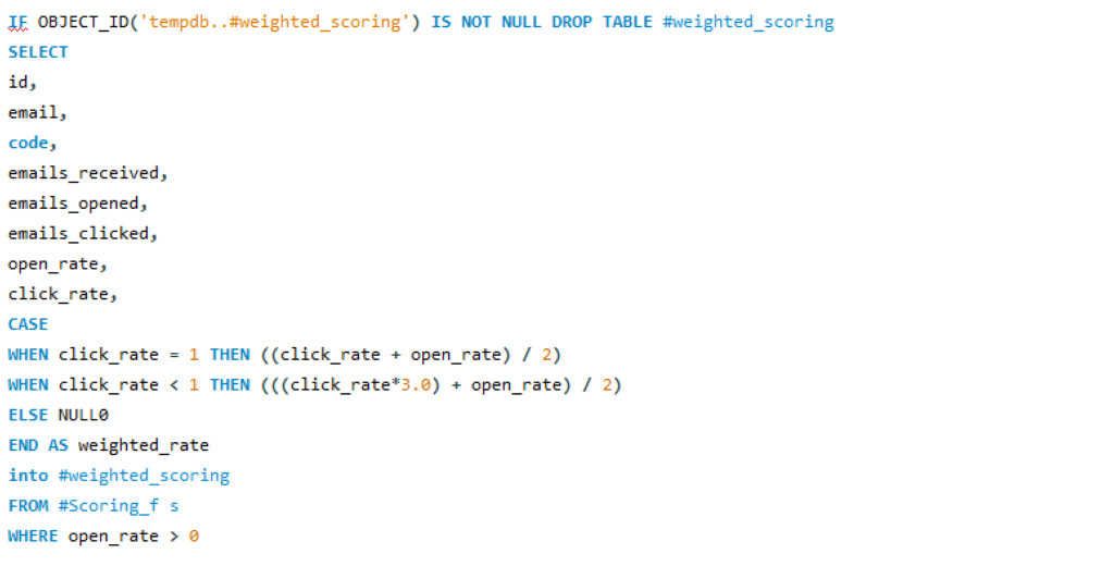
Audience Segmentation & Ticketing Insights
Marketing Analytics
🔬 Analyst + 📋 Product Owner
Professional
🔒 Anonymized Mockup
Audience
Segmentation
Insights Dashboard
Who fills the venues — and where are they? A 10-segment audience analysis across ticket sales, revenue share, and geographic concentration that directly informed a targeted campaign strategy delivering a 5x return on ad spend.
🔒 Anonymized Mockup
This is a mockup version built on dummy data to represent an analysis I completed professionally. The original work informed a real campaign strategy — the methodology, segment taxonomy, and analytical approach shown here mirror what was built, with all client and proprietary data replaced with synthetic equivalents.
Power BI
Audience Segmentation
Marketing Attribution
Geographic Analysis
Campaign Strategy
Ticket Sales Analytics
Revenue Optimization
The Problem
Who's filling the venue
and where are they?
Collegiate sports properties generate ticket sales from dramatically different buyer types — from devoted season-ticket loyalists to last-minute casual buyers. Without a way to distinguish between them, every marketing dollar gets distributed the same way to everyone.
The challenge wasn't just identifying segments — it was understanding their relative contribution to revenue versus tickets, their geographic concentration, and how those patterns varied market by market. A segment that over-indexes in one region might be nearly absent in another.
Most reporting answered “how many tickets did we sell?” This analysis was built to answer: who bought them, where did those people come from, and which segments are driving the most value per transaction?
The output wasn't just a dashboard — it was the foundation for a targeted campaign that achieved a 5x return on ad spend by focusing creative and media on the highest-value segments in their highest-concentration markets.
Gap 01 · Undifferentiated SpendCampaign budgets were being distributed evenly across audiences with no view into which segments generated the highest revenue per ticket or responded best to targeted creative.
Gap 02 · No Geographic ContextTicket sales data existed at the transaction level but wasn't mapped to segment-level geographic concentration — making regional media buys impossible to optimize.
Gap 03 · Revenue vs Ticket MismatchHigh-volume segments weren't always high-revenue segments. Without separating ticket share from revenue share, the highest-value buyers were hidden in aggregate numbers.
Gap 04 · Market Variation InvisibleSegment mix varied significantly by market, but without a cross-market view, properties couldn't identify where specific segments over- or under-indexed relative to expectation.
My Role
From purchase data
to campaign strategy
🔬What I Analyzed & Built
- Defined the 10-segment audience taxonomy — mapped behavioral and purchase patterns to named archetypes that were meaningful to both marketing and operations teams
- Analyzed purchase data across segments — calculated ticket share and revenue share separately to surface the delta between volume buyers and value buyers
- Built geographic concentration analysis — identified top states per segment to enable precise regional media targeting
- Created segment mix by market view — surfaced over- and under-indexing segments across regions, giving properties actionable insight into where each audience type concentrates
- Built the Power BI dashboard — designed for marketing and strategy stakeholders, not data teams; optimized for fast interpretation and campaign decision support
📋Scope & Context
- Professional project — this analysis was completed as part of my work in collegiate sports marketing at Learfield; this version uses anonymized dummy data to protect client and campaign details
- Directly actionable — the output wasn't a research artifact; it was immediately handed to campaign managers as the targeting brief for creative and media deployment
- Built for non-technical stakeholders — every view in the dashboard was designed so a marketing director could make a decision in under 60 seconds without SQL access
- Geography was the unlock — the segment taxonomy alone was useful; knowing that The Loyalist concentrates in specific states and The Digital Native in others was what turned insight into action
- 5x ROAS outcome — the campaign informed by this analysis delivered a 5x return on ad spend by focusing on the highest-value segments in their highest-density markets
The Approach
From purchase data
to targeting brief
Five stages — from raw transactional data to a campaign-ready audience map.
01Segment DesignDefined 10 audience archetypes based on purchase behavior, timing, frequency, and spending patterns.
02Data AnalysisCalculated ticket share and revenue share separately per segment — surfacing the delta between volume buyers and value buyers.
03Geo MappingIdentified top states for each segment, mapping purchase data to geographic concentration to enable regional media targeting.
04Market Mix ViewBuilt a cross-market comparison to spot segments that over- or under-index by region, surfacing market-specific opportunity gaps.
05Dashboard BuildDesigned a Power BI dashboard for marketing decision-makers — fast to read, built around campaign decisions, not raw data exploration.
Audience Segments
Ten archetypes.
One complete picture.
Each segment was defined around a distinct behavioral profile — how they buy, when they buy, how much they spend, and what motivates them to show up. Naming the segments made them real to stakeholders in a way that raw cohort IDs never could.
👑
The Loyalist
Season-ticket holder behavior. High frequency, high spend, geographically stable. The anchor segment for renewal strategy.
📱
The Digital Native
Mobile-first buyer. Responds to digital creative, social proof, and last-minute deals. High acquisition potential via paid social.
👪
The Family Planner
Plans ahead, buys in groups, values experience over price. Strong ticket volume, moderate revenue per head.
⚡
The Trend Seeker
Attracted to marquee matchups and cultural moments. Sporadic attendance but high spend when engaged.
💼
The Business Casual
Corporate or client entertainment buyer. High per-ticket spend, premium seat preference, low frequency.
🎵
The Casual Listener
Infrequent buyer. Low engagement, price-sensitive. High volume segment with limited revenue contribution.
🏅
The Superfan
Deep team or athlete affinity. Drives merchandise and premium upsell. Most responsive to identity-based creative.
🍻
The Social Scene
Event-as-outing buyer. Group purchases, experience-led, social sharing behavior. Strong for mid-week and secondary events.
⏰
The Last-Minute Buyer
Day-of or same-week purchaser. Price responsive, mobile purchase pattern. High volume in sellout conditions.
📍
The Local Explorer
Proximity-driven buyer. Strong in college towns and regional markets. Responds to local identity and community messaging.
Segment names and descriptions shown here are representative of the methodology — specific behavioral thresholds and scoring logic from the original analysis are not disclosed.
The Output
Revenue vs. tickets.
Where the delta lives.
A Power BI dashboard built for marketing decision-makers — each view answers one specific question a campaign manager actually asks before allocating budget.

Revenue & Ticket Share by Segment — the primary view. Separating ticket volume from revenue contribution reveals which segments are high-value buyers versus high-frequency but low-spend audiences — a distinction that changes where you put media dollars.
Power BI10 SegmentsAnonymized Data
Revenue Detail by Segment
Drill-down view — revenue contribution per segment with comparative context
Ticket Sales Breakdown
Ticket volume by segment — showing where volume and value diverge
Geographic & Market Mix
Top states per segment · over/under-indexing by market
Segment Mix by Market
Additional view not shown
Segment Mix by Market
Cross-market segment comparison · spotting regional over/under-indexing
Results
The stat sheet
5xReturn on Ad SpendThe campaign informed by this analysis delivered a 5x ROAS by concentrating spend on the highest-value segments in their highest-density markets.
10 segAudience ArchetypesTen distinct behavioral segments mapped from purchase data — each with a named identity, revenue profile, and geographic signature.
3 viewsDashboard DimensionsRevenue & ticket share by segment, top states by segment, and segment mix by market — each answering a different campaign question.
≥1 mktMarket Variation SurfacedSegment concentrations varied meaningfully across markets — making geographic targeting the key lever the analysis unlocked.
Analyst Lens
Key decisions & tradeoffs
The choices that shaped the analysis — especially the ones where the “richer” option was deliberately not the right one.
| Decision | Rationale | Tradeoff |
|---|---|---|
| Named segments over cohort IDs | Labeling segments with human names (The Loyalist, The Digital Native) rather than numeric cohorts made the taxonomy immediately usable by marketing teams who had no analytical background. Stakeholders could talk about segments in creative briefs and media plans without needing to reference a data dictionary. | Less technically precise — named archetypes carry implicit assumptions that raw cohort IDs don't. The tradeoff was deliberate: a segment that drives action is worth more than one that's methodologically pristine but unused. |
| Ticket share vs. revenue share separated | Keeping ticket volume and revenue contribution as distinct metrics was the analytical unlock. Many segments had inverted profiles — high ticket share but low revenue share (The Casual Listener) or low ticket share but high revenue share (The Business Casual). Blending them into a single metric would have obscured the delta entirely. | Cleaner campaign logic — separating the two allowed media budgets to target value segments rather than just volume segments, which directly contributed to the 5x ROAS outcome. |
| Geography as the primary action lever | The segment taxonomy alone told you who to target. The geographic concentration view told you where. Combining them was what turned the analysis from interesting to actionable — a media buyer could translate it directly into a regional paid social or programmatic strategy. | Immediately deployable — no additional data transformation required between dashboard and media plan. The geographic output was the targeting brief. |
| Designed for decision speed, not exploration | The dashboard was built for a marketing director making a budget call, not an analyst doing exploratory research. Every view answers one specific question and surfaces the answer in the top half of the screen. Filtering and drill-down were secondary to immediate readability. | Limited self-serve depth — the dashboard doesn't support ad hoc slicing by an analyst user. A deeper exploration layer was deliberately scoped out in favor of decision-speed for the primary audience. |
×